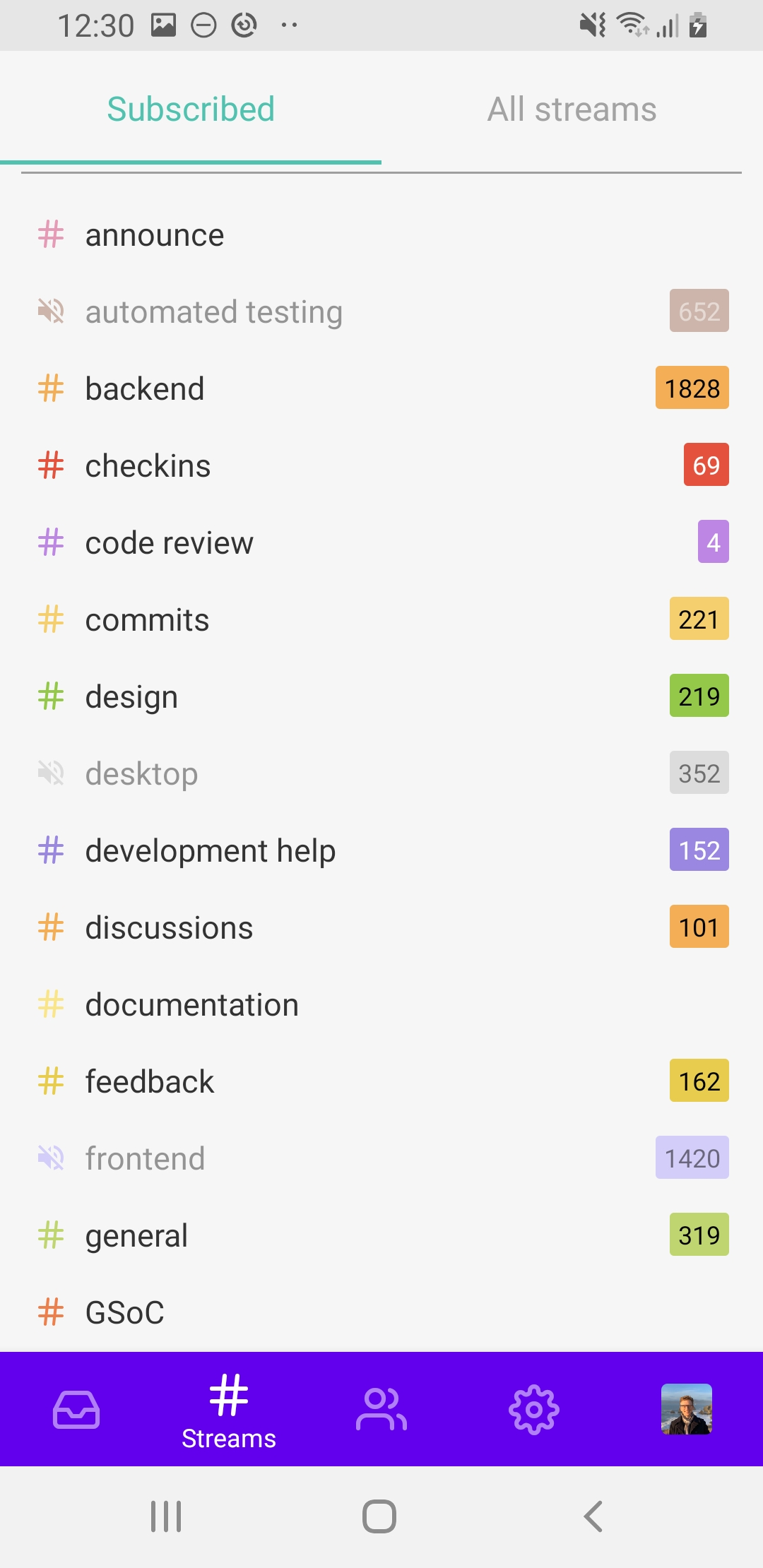
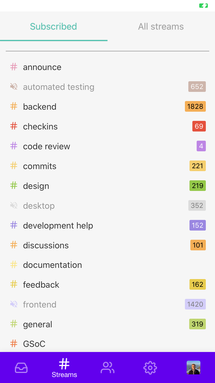
home screen: Use material tabs for bottom navigation. #4176
Conversation
| }, | ||
| { | ||
| backBehavior: 'none', | ||
| initialLayout: { width: Dimensions.get('window').width }, |
There was a problem hiding this comment.
This is required to prevent a layout bug that happens in the first few moments of initial render.
Use `createMaterialTopTabNavigator` for bottom navigation. The
previously used `createBottomTabNavigator` gave no feedback on
tapping the icons, which is bad UX. Infact, on low end devices,
navigating to different screens can take a noticable amount of
time, and sometimes it feels that the touch didn't register. Using
these fixes the issue.
| import ProfileCard from '../account-info/ProfileCard'; | ||
|
|
||
| export default createBottomTabNavigator( | ||
| export default createMaterialTopTabNavigator( |
There was a problem hiding this comment.
Hmm, interesting. I wonder why this still puts the tabs on the bottom, when it looks like we're asking for it to make a "top" tab navigator here.
To get the buttons to show feedback, I wonder about still using createBottomTabNavigator, but with something special for the tabBarButton setting: https://reactnavigation.org/docs/bottom-tab-navigator/#tabbarbutton
There was a problem hiding this comment.
It's at the bottom because I passed this option in line 66:
tabBarPosition: 'bottom'
I tried Touchable from our 'commons', but it did not give any feedback at all - because it changes opacity on tap, and that does not change the appearance in this case, and also causes a weird layout bug for our 'PMs' icon - because it comes with an unread count indicator, and it becomes misplaced.
I feel material tabs are a good option, because they provide good feedback without an additional setup, along with a nice indicator for the active tab.
There was a problem hiding this comment.
I feel material tabs are a good option
I agree. I think the problem I have is that createMaterialTopTabNavigator is...just that, a thing to get material tabs at the top. From the doc:
A material-design themed tab bar on the top of the screen [...]
Aha, though! After taking a look at the documentation, it looks like there may be a compromise between createBottomTabNavigator and createMaterialTopTabNavigator:
createMaterialBottomTabNavigator
Have you tried that? 🙂
There was a problem hiding this comment.
Yep, I already tried that. But we don't have access to createMaterialBottomTabNavigator - the package we use - 'react-navigation-tabs' only provides two exports:
The package exports two different navigators:
createBottomTabNavigator: iOS like bottom tabs.
createMaterialTopTabNavigator: Material design themed top tabs with swipe gesture, from react-native-tab-view.
So, I didn't want to add an extra dependency for material bottom tabs when I was able to use material top tabs. Do you want me to add the dependency createMaterialBottomTabNavigator (yarn add @react-navigation/bottom-tabs) or is this fine? I guess if I do add the dependency, I'll also have to create a flow libdef.
I think we should not add an extra dependency when we are able to configure createMaterialTopTabNavigator to do the job, but I'll let you make the final decision.
There was a problem hiding this comment.
Mm, earlier, I didn't see that createMaterialBottomTabNavigator means adding another dependency (actually two; the doc says to install react-navigation-material-bottom-tabs and react-native-paper). This would still be true after #4114, as createMaterialBottomTabNavigator isn't exposed by the plain react-navigation library. Making a libdef can be a pain, but it can also be pretty straightforward; we have a growing doc about it, which it may be productive to add to.
I'm still a bit torn; @gnprice, do you have thoughts on this? Someday, without declaring it as a breaking change, createMaterialTopTabNavigator could reasonably drop the ability to be hacked into showing bottom tabs instead of top tabs.
I've just tested out createMaterialBottomTabNavigator; it worked with these versions:
"react-navigation-material-bottom-tabs": "^0.4.0"(any later, and there are issues with its dependencies or peerDependencies)"react-native-paper": "^2.0.1"(react-navigation-material-bottom-tabshas this in its peerDependencies)
Just replacing createBottomTabNavigator with createMaterialBottomTabNavigator, and not adding any additional config, this is what it looks like on Android and iOS. It's quite different from what we have now, but there's lots of config available:
On Android, there is a "ripple" effect, like the animation at this doc except the colors don't change (looks like you can optionally give a different color to each tab). It looks like there's no feedback, by default, on iOS. (The latest version explicitly documents a way to switch out the TouchableWithoutFeedback component) .
I do slightly prefer the way it shows which tab is selected; in particular, I like seeing the smooth appearance and disappearance of the tab's name in addition to the icon. We likely wouldn't choose this indigo color, but I like how the icons are translucent when not focused.
There was a problem hiding this comment.
We likely wouldn't choose this indigo color
Heh, though it does more closely match the new logo we now have! #4200
There was a problem hiding this comment.
Luckily, our app uses global constants for the theme colours everywhere, so it will be very easy to change the theme colours in other places too.
|
One thing I see in the screen recording (thanks for including that!) is that there's a highlight at the bottom edge of the selected tab. That's characteristic of Material top tabs, and it gives a sense that it's controlling something that comes below. When the tabs are at the bottom, below what they're controlling, that sense is inaccurate, so it'd be good to avoid. That's a good reason to use |
|
|
4 participants
Use
createMaterialTopTabNavigatorfor bottom navigation. Thepreviously used
createBottomTabNavigatorgave no feedback ontapping the icons, which is bad UX. Infact, on low end devices,
navigating to different screens can take a noticable amount of
time, and sometimes it feels that the touch didn't register. Using
these fixes the issue.