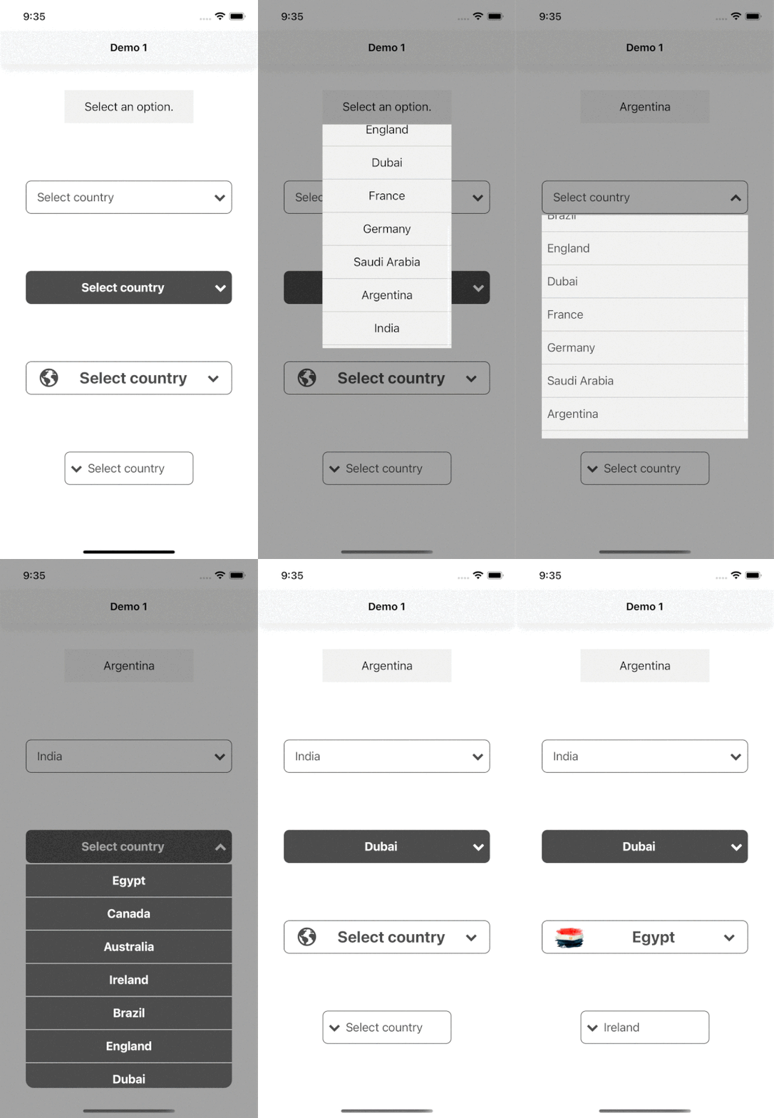
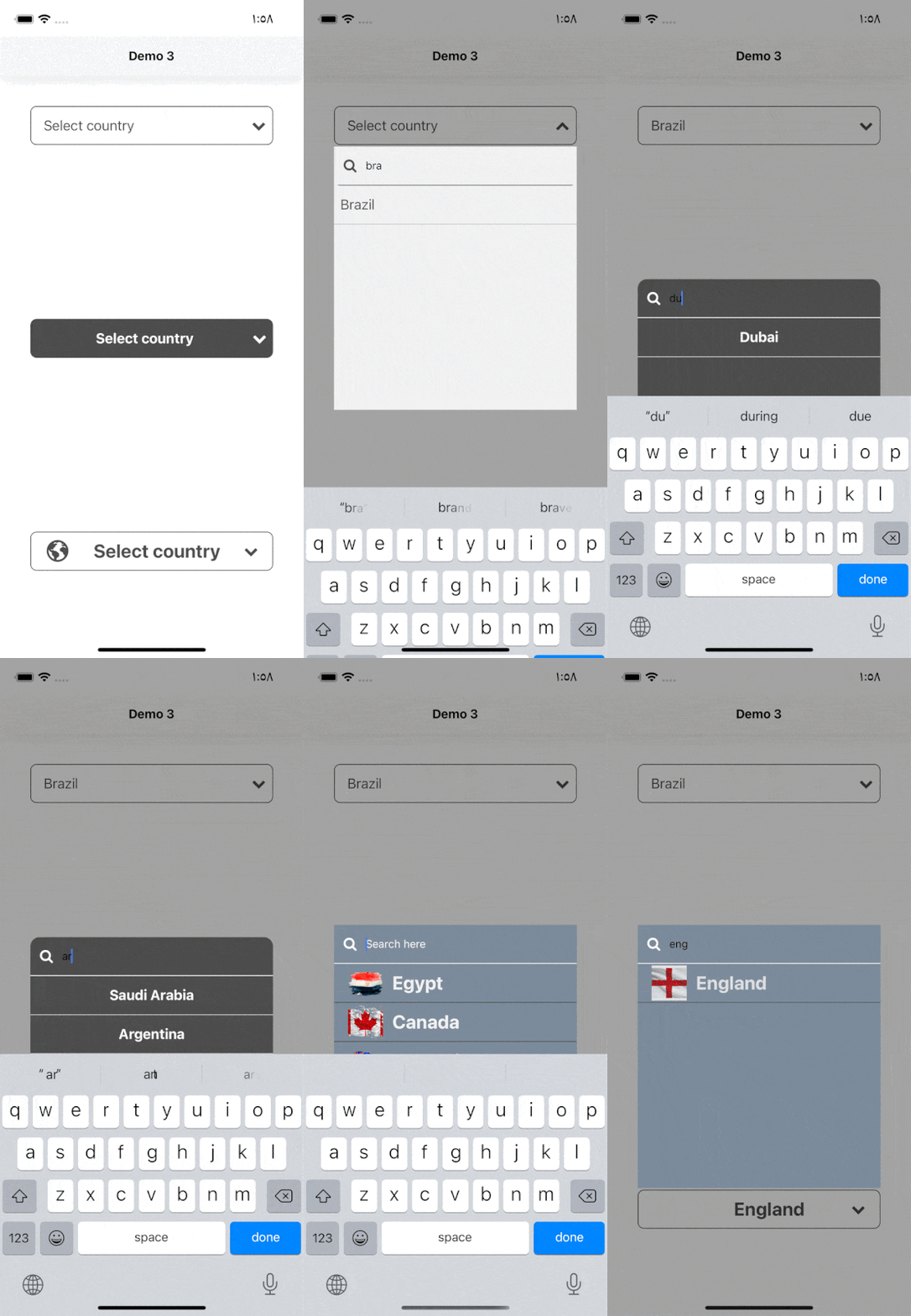
react-native-select-dropdown is a highly customized dropdown | select | picker | menu for react native that works for android and iOS platforms.
npm install react-native-select-dropdownyarn add react-native-select-dropdownimport SelectDropdown from 'react-native-select-dropdown'
...
const countries = ["Egypt", "Canada", "Australia", "Ireland"]
...
<SelectDropdown
data={countries}
onSelect={(selectedItem, index) => {
console.log(selectedItem, index)
}}
buttonTextAfterSelection={(selectedItem, index) => {
// text represented after item is selected
// if data array is an array of objects then return selectedItem.property to render after item is selected
return selectedItem
}}
rowTextForSelection={(item, index) => {
// text represented for each item in dropdown
// if data array is an array of objects then return item.property to represent item in dropdown
return item
}}
/>
array of data that will be represented in dropdown 'can be array of objects
| Type | Required |
|---|---|
| array | Yes |
function recieves selected item and its index in data array
| Type | Required |
|---|---|
| function | Yes |
default button text when no item is selected
| Type | Required |
|---|---|
| String | No |
function recieves selected item and its index, this function should return a string that will be represented in button after item is selected
| Type | Required |
|---|---|
| function | Yes "unless you customized button using renderCustomizedButtonChild" |
function recieves item and index for each row in dropdown, this function shoud return a string that will be represented in each row in dropdown
| Type | Required |
|---|---|
| function | Yes "unless you customized button using renderCustomizedRowChild" |
default selected item in dropdown ( check examples in Demo1)
| Type | Required |
|---|---|
| any | No |
default selected item index
| Type | Required |
|---|---|
| integer | No |
disable dropdown
| Type | Required |
|---|---|
| boolean | No |
disable auto scroll to selected value
| Type | Required |
|---|---|
| boolean | No |
disable choose all Rows index in the list
| Type | Required |
|---|---|
| array | No |
function fires when dropdown is opened
| Type | Required |
|---|---|
| function | No |
function fires when dropdown is closed
| Type | Required |
|---|---|
| function | No |
function fires when dropdown scrolls to the end (for paginations)
| Type | Required |
|---|---|
| function | No |
style object for button
| Type | Required |
|---|---|
| object | Yes |
style object for button text
| Type | Required |
|---|---|
| object | No |
function recieves selected item and its index, this function should return a React component as a child for dropdown button buttonStyle should be used for parent button view style.
| Type | Required |
|---|---|
| function | No |
function that should return a React component for dropdown icon
| Type | Required |
|---|---|
| function | No |
dropdown icon position "left" || "right"
| Type | Required |
|---|---|
| string | No |
required to set true when statusbar is translucent (android only)
| Type | Required |
|---|---|
| boolean | No |
style object for dropdown view
| Type | Required |
|---|---|
| object | No |
backdrop color when dropdown is opened
| Type | Required |
|---|---|
| string | No |
When true, shows a vertical scroll indicator.
| Type | Required |
|---|---|
| boolean | No |
style object for row
| Type | Required |
|---|---|
| object | Yes |
style object for row text
| Type | Required |
|---|---|
| object | No |
style object for selected row
| Type | Required |
|---|---|
| object | Yes |
style object for selected row text
| Type | Required |
|---|---|
| object | No |
function recieves item and its index, this function should return React component as a child for customized row rowStyle should be used for parent row view style.
| Type | Required |
|---|---|
| function | No |
enable search functionality
| Type | Required |
|---|---|
| boolean | No |
style object for search input
| Type | Required |
|---|---|
| object | No |
text color for search input
| Type | Required |
|---|---|
| string | No |
style object for search input text
| Type | Required |
|---|---|
| object | No |
placeholder text for search input
| Type | Required |
|---|---|
| string | No |
text color for search input placeholder
| Type | Required |
|---|---|
| string | No |
function returns React component for search input icon
| Type | Required |
|---|---|
| function | No |
function returns React component for search input icon
| Type | Required |
|---|---|
| function | No |
function callback when the search input text changes, this will automatically disable the dropdown's internal search to be implemented manually outside the component
| Type | Required |
|---|---|
| function | No |
| Method | Description |
|---|---|
reset() |
Remove selection & reset it to display defaultButtonText check AdelRedaa97#1 (comment). |
openDropdown() |
Open the dropdown. |
closeDropdown() |
Close the dropdown. |
selectIndex(index) |
Select a specific item by index. |


