


Mobile friendly datetime picker for Vue. Supports date, datetime and time modes, i18n and more.
yarn add luxon vue-datetime weekstartOr
npm install --save luxon vue-datetime weekstartweekstart is optional, is used to get the first day of the week.
import Vue from 'vue'
import { Datetime } from 'vue-datetime'
// You need a specific loader for CSS files
import 'vue-datetime/dist/vue-datetime.css'

Vue.use(Datetime)import { Datetime } from 'vue-datetime';
Vue.component('datetime', Datetime);import { Datetime } from 'vue-datetime';
Vue.extend({
template: '...',
components: {
datetime: Datetime
}
});Download vue, luxon, weekstart and vue-datetime or use a CDN like unpkg.
<link rel="stylesheet" href="vue-datetime.css"></link>
<script src="vue.js"></script>
<script src="luxon.js"></script>
<script src="weekstart.js"></script>
<script src="vue-datetime.js"></script>
The component registers itself automatically as <datetime>. If you want to use a different name then register it explicitly:
Vue.component('vue-datetime', window.VueDatetime.Datetime);weekstart is optional, is used to get the first day of the week.
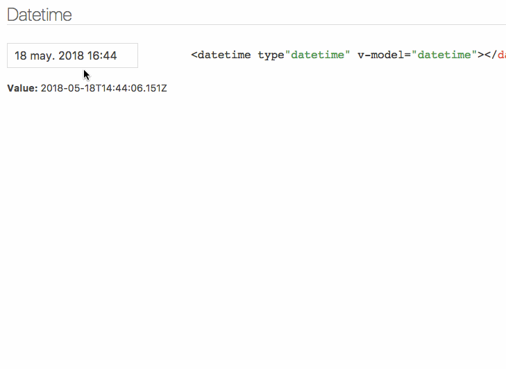
<datetime v-model="date"></datetime>| Parameter | Type | Default | Description |
|---|---|---|---|
| v-model (required) | ISO 8601 String |
- | Datetime. |
| type | String |
date |
Picker type: date, datetime or time. |
| input-id | String |
'' |
Id for the input. |
| input-class | String, Array or Object |
'' |
Class for the input. |
| input-style | String, Array or Object |
'' |
Style for the input. |
| hidden-name | String |
null |
Name for hidden input with raw value. See #51. |
| value-zone | String |
UTC |
Time zone for the value. |
| zone | String |
local |
Time zone for the picker. |
| format | Object or String |
DateTime.DATE_MED, DateTime.DATETIME_MED or DateTime.TIME_24_SIMPLE |
Input date format. Luxon presets or tokens. |
| phrases | Object |
{ok: 'Ok', cancel: 'Cancel'} |
Phrases. |
| use12-hour | Boolean |
false |
Display 12 hour (AM/PM) mode |
| hour-step | Number |
1 |
Hour step. |
| minute-step | Number |
1 |
Minute step. |
| min-datetime | ISO 8601 String |
null |
Minimum datetime. |
| max-datetime | ISO 8601 String |
null |
Maximum datetime. |
| auto | Boolean |
false |
Auto continue/close on select. |
| week-start | Number |
auto from locale if weekstart is available or 1 |
First day of the week. 1 is Monday and 7 is Sunday. |
| flow | Array |
Depends of type | Customize steps flow, steps available: time, date, month, year. Example: ['year', 'date', 'time'] |
| title | String |
'' |
Popup title. |
| hide-backdrop | Boolean |
false |
Show/Hide backdrop. |
| backdrop-click | Boolean |
true |
Enable/Disable backdrop click to cancel (outside click). |
| datetime-disabled-checker | Function |
(year, month, day, hour, minute, second) => false |
For each possible option selection the appropriate date parts are provided to allow for a custom validation function for allowed selections |
Input inherits all props not defined above but style and class will be inherited by root element. See inheritAttrs option |
The component is based on Luxon, check out documentation to set time zones and format.
Date internationalization depends on luxon. Set the default locale.
import { Settings } from 'luxon'

Settings.defaultLocale = 'es'Component emits the input event to work with v-model. More info.
close event is emitted when the popup closes.
Also, input text inherits all component events.
You can customize the component using named slots.
Available slots: before, after, button-cancel and button-confirm
<datetime v-model="date" input-id="startDate">
  <label for="startDate" slot="before">Field Label</label>
  <span class="description" slot="after">The field description</span>
  <template slot="button-cancel">
    <fa :icon="['far', 'times']"></fa>
    Cancel
  </template>
  <template slot="button-confirm">
    <fa :icon="['fas', 'check-circle']"></fa>
    Confirm
  </template>
</datetime>
You can also use slot-scope to determine which view is currently active:
<template slot="button-confirm" slot-scope="scope">
  <span v-if='scope.step === "date"'>Next <i class='fas fa-arrow-right' /></span>
  <span v-else><i class='fas fa-check-circle' /> Publish</span>
</template>
Theming is supported by overwriting CSS classes.
yarn testyarn devBundle the js and css to the dist folder:
yarn build