Solution #571
Solution #571
Conversation
There was a problem hiding this comment.
Hey, great job on the implementation! There are still a few things to improve. I’ve reviewed the app in desktop view, and while it looks okay overall, the user experience with the loaders feels off. They appear too frequently—almost every time I click on something, there’s a loader.
The transitions also feel a bit overdone; maybe stick to a simple opacity change instead. On the home page, the carousel behaves strangely. When I click, it sometimes swipes one item at a time, but other times it swipes all four items at once. For the banner images, the transitions feel awkward—just a simple swipe effect would work better.Even the buttons have transitions, which makes them unclickable for a short while. This creates a frustrating experience for the user.
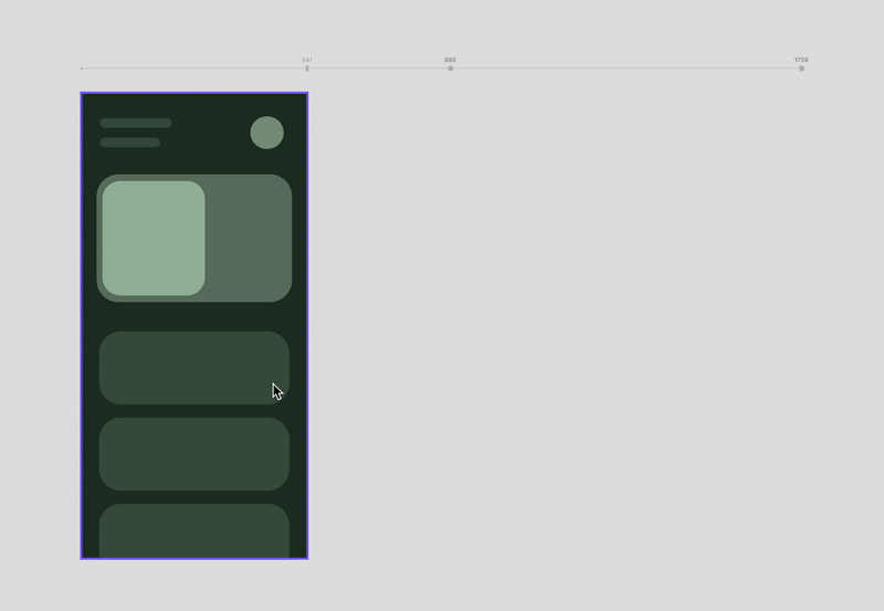
On mobile this spacing between cards looks ugly

I have noticed some dead code for example redux slices for comments, posts, users that aren't used.
There was a problem hiding this comment.
- you don't need to reload the entire page (phones, tablets, accessories) when changing the sorting or items per page - just rerender the list of products.
- text "Items on page" is slightly displaced

- on phones, tablets and accesories pages, elements remain fixed while margins expand as the page resizes. they should adjust dynamically, as the current behavior results in disproportionately large margins

There was a problem hiding this comment.
- layout isn't responsive for pages: phones, tablets and accessories, it's fixed with breakpoints. here you have differences between fixed and responsive layout. and here you have some example how looks responsive layout with breakpoints
- you don't need to reload the entire page (phones, tablets, accessories) when changing the sorting or items per page - just rerender the list of products
https://bajkowsky.github.io/react_phone-catalog/