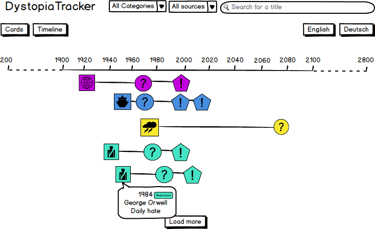
Timeline view | V2 Specs
- Header stays the same
- Filtering and text search logic stay in place
- Potential use of icons in addition to colors to indicate category
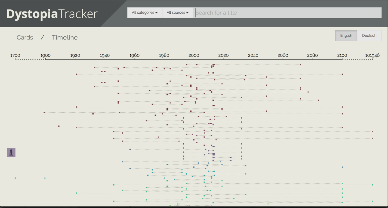
- all data points are displayed on the canvas (they are loaded per
- squares for predictions
year_published - circles for predicted realisations (
year_predicted) - circles for actual realisations (
year_introduced) - lines between data points are permanently shown with opacity 0.3
- squares for predictions
- Squares and circles are colored by the category of the prediction (same as cards)
- Every data point (prediction, predicted realisation, actual realisation) is displayed on a separate line
- order along y-axis:
- cluster by category (color)
- editor's picks
- date of creation in DB
- order along y-axis:
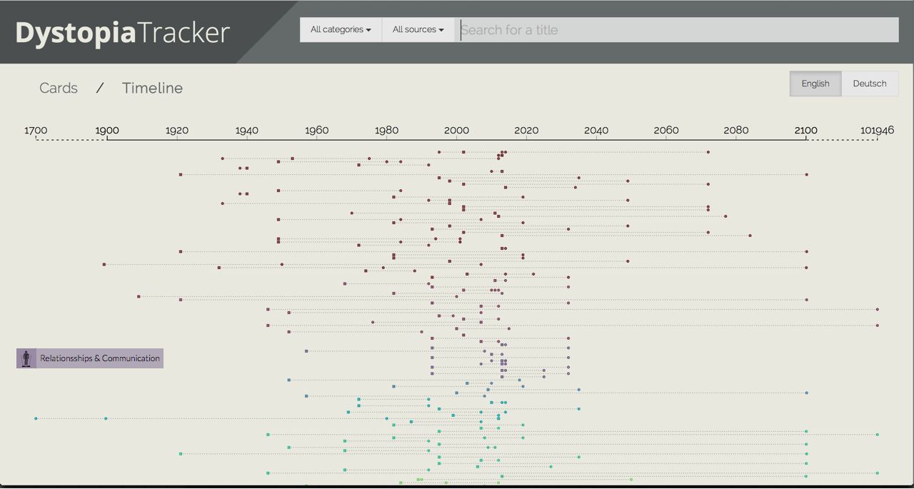
- along the y-axis labels will indicate the names of the respective categories
-
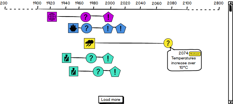
On click or touch on a square/circle
- tooltip of clicked/touched square/circle is shown, consisting of:
- Headline (added by editor)
- fall back for Headline: Description
- Date
- Button "Read more"
- all other data points fade to opacity 0.5
- only one tooltip is shown at once
- only one line is shown at opacity 1 once
- tooltip of clicked/touched square/circle is shown, consisting of:
-
On click or touch on whitespace
- line and tooltip disappear
- Focus is on visualization rather than navigation
- Zooming on tablet and mobile will need to "work by hand"
- All category labels are shown by default
- The are placed centrally on the "y-axis area" covered by the respective category's lines
- They have the category colors and the following icons
- Important: we need to use proper attribution for all CC BY 3.0 icons (txt file in the folder)
- On click a label (Opacity 0.7) pops out that shows the category name (only one label shown at the same time)