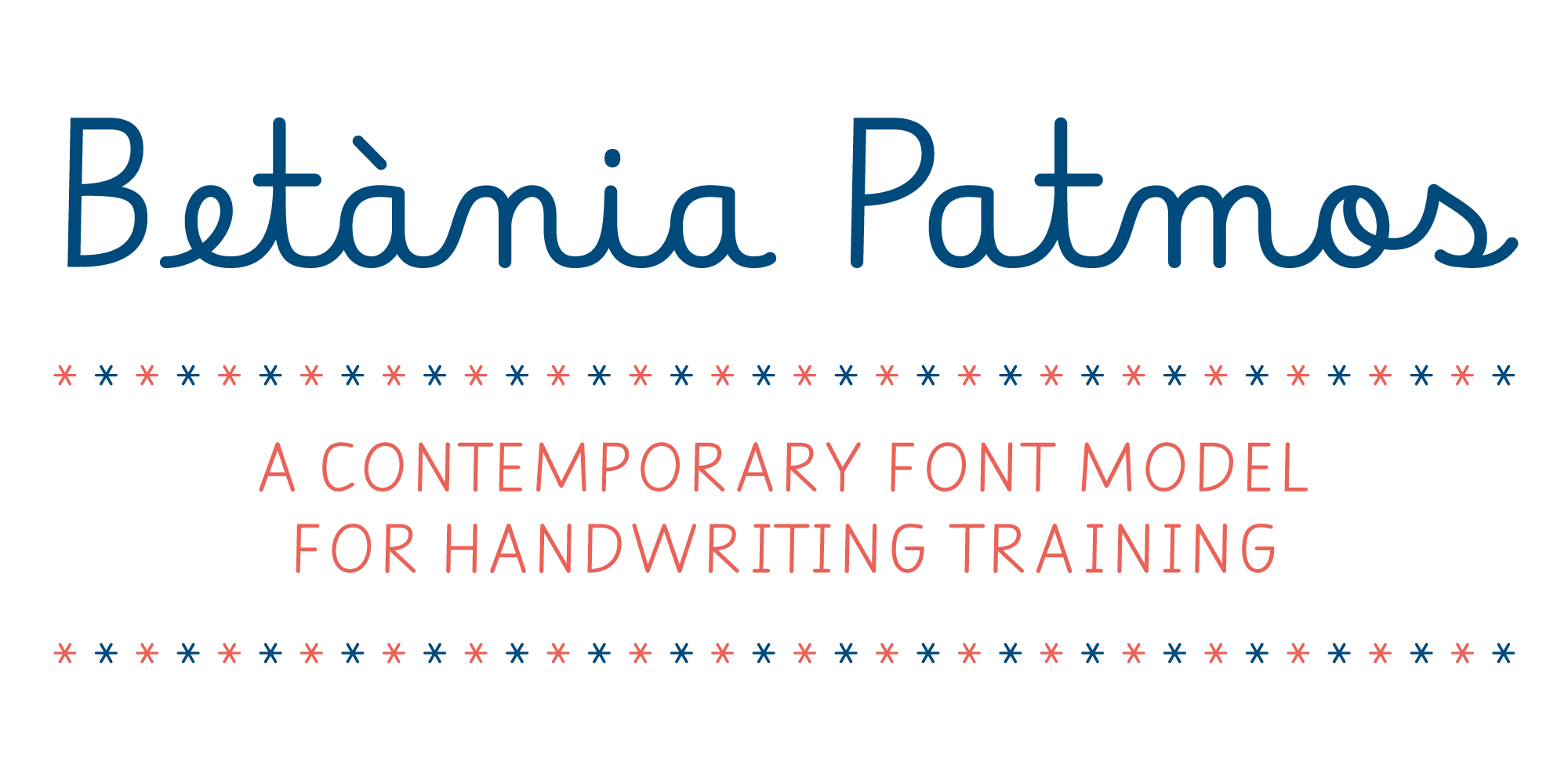
A contemporary font model for handwriting training (Spanish below)
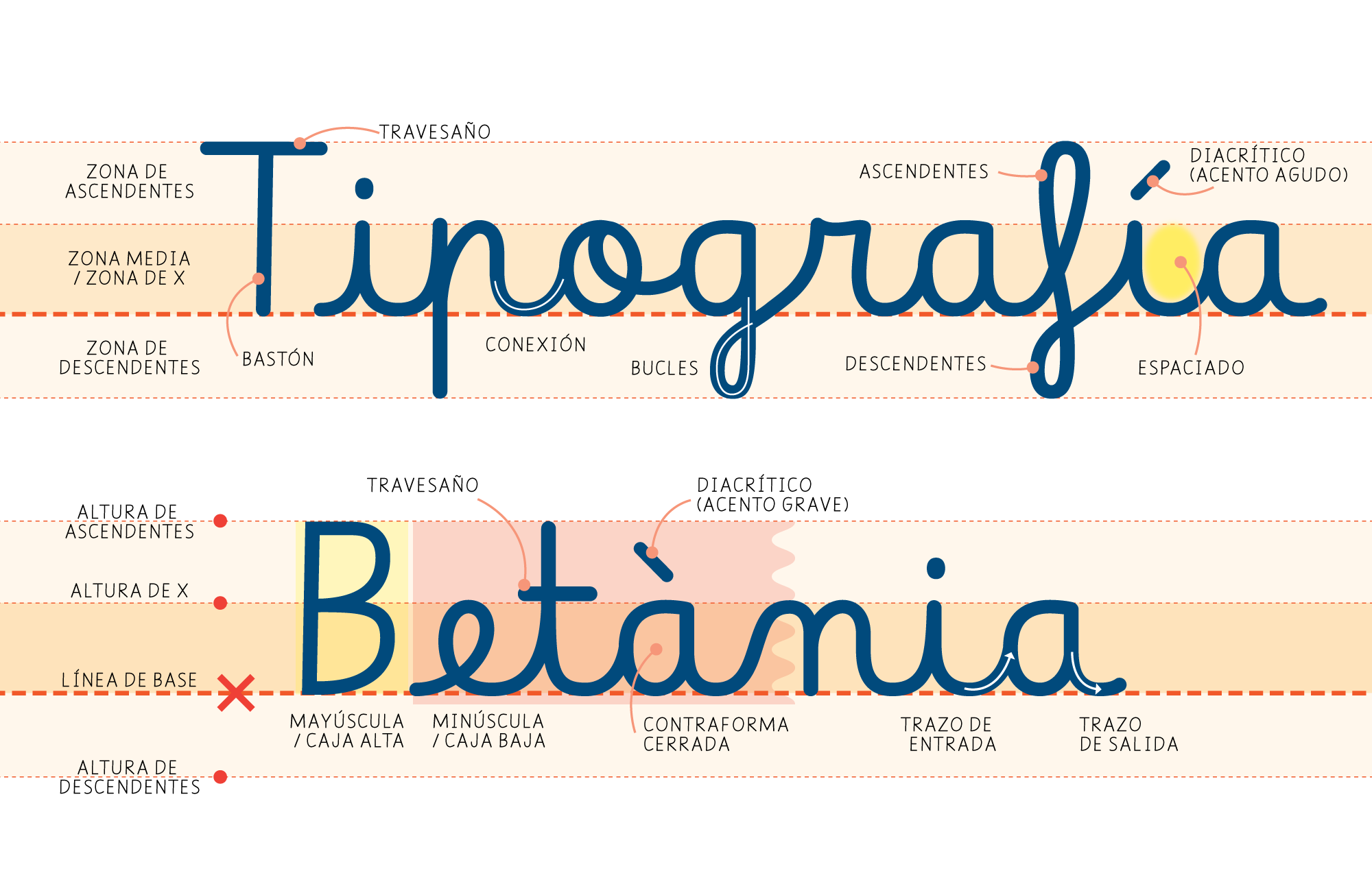
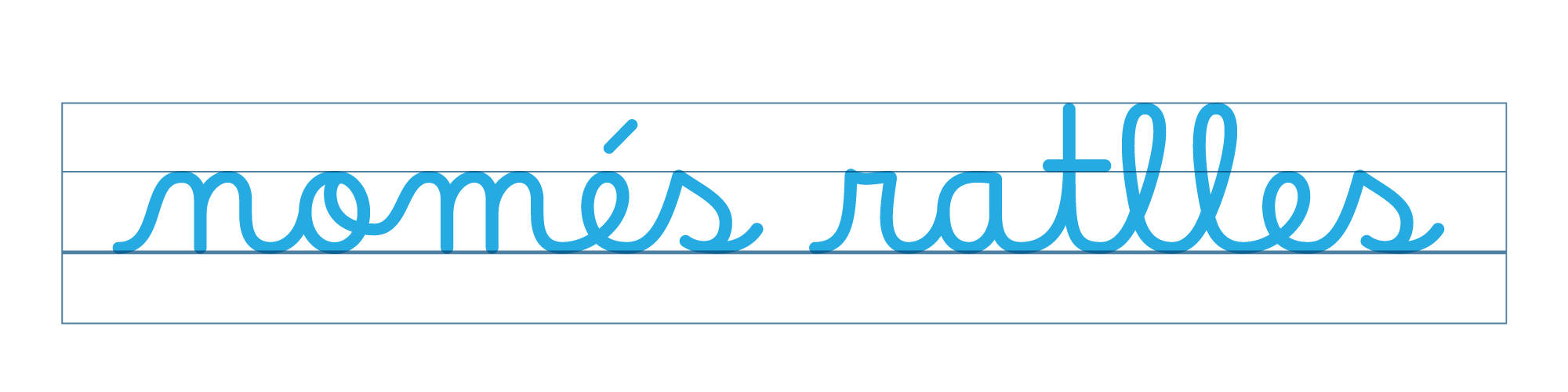
BP has an austere morphology to facilitate the recognition of the ductus of the signs. It is not a display typeface; it is a tool for teaching literacy.
This project focuses on the aspects we consider critical in this typeface paradigm:
1 • Austere design to avoid ambiguities to recognizing the essential ductus of a sign’s structure.
2 • Simplified functionality. Designed so that teachers or people unfamiliar with design programs can self-edit educational worksheets or pedagogical material using tools like LibreOffice, Notepad, TextEdit, Microsoft Office, etc. The OpenType development is structured with contextual alternates, following the model proposed by Rosalie Wagner, which ensures compatibility with these tools.
3 • Interdisciplinary team. We reviewed the models and typefaces in use and redefined design and functional decisions. The inclusion of teachers, pedagogues, and the TIACC team (Technologies for Information and Learning in Educational Centers) introduces the perspective of the end user and the readers of the typeface.
4 • Performance. Its horizontal proportions are slightly condensed, improving word count per line/page.
• License: Released under the SIL Open Font Licence, and is available for free download. • Users: Teachers, educators, pedagogues, and anyone involved in the process of teaching reading and writing. • Readers: Preschool and early elementary school students. • Purpose: Educational worksheets or self-editable pedagogical material. • Guidelines: Avoid decorative elements and loops to emphasize essential structure. • Compatibility: The typeface is compatible with office software and ideally should also be integrated into Google Drive. • OpenType Features: Adheres to Rosalie Wagner’s documentation for contextual alternates (CALT). This is not a display typeface; it is specifically designed for non-design professionals and classroom use.
- Escolar 1 – currently in use
- https://github.com/RosaWagner/Borel / Rosalie Wagner – main reference
- Ana Ronchi
- https://smed2015.it/formarsi-a-milano/
- https://primarium.info/about/ / Primarium


////
Un modelo tipográfico contemporáneo para la enseñanza de la lectoescritura.
Betània Patmos tiene una morfología austera para facilitar el reconocimiento del ductus de los signos. No es una tipografía display, es una herramienta para la enseñanza de la lecto-escritura.
Este proyecto pone el foco en algunos aspectos que consideramos críticos en este paradigma tipográfico:
1 • Diseño austero para evitar ambigüedades al momento de reconocer el ductus esencial de las letras, su estructura identitaria.
2 • Funcionalidad simplificada. Proyectada para que docentes o personas no familiarizadas con los programas de diseño puedan componer y autoeditar fichas educativas o material pedagógico utilizando herramientas como LibreOffice, Notepad, TextEdit, Microsoft Office, etc. El desarrollo OpenType está estructurado con reemplazos contextuales (contextual alternate / calt), siguiendo el modelo propuesto por Rosalie Wagner, que contempla la compatibilidad con estas aplicaciones.
3 • Equipo interdisciplinario. Analizamos los modelos y tipografías en uso y reformulamos decisiones de diseño y funcionamiento. La inclusión de docentes, pedagogos y el TIACC (equipo responsables de estudiar las Tecnologías para la Información y el Aprendizaje en los Centros Educativos) suma la mirada del usuario final y de las y los lectores de la tipografía.
4 • Rendimiento. Sus proporciones horizontales son levemente condensadas, mejorando su eficacia y economía de palabras por línea de texto.
• Licencia: Desarrollado bajo licencia SIL Open Font Licence y es de libre descarga. • Usuarixs: Docentes, educadores, pedagogxs y otras personas involucradas en el proceso de enseñanza de la lectoescritura. • Lectores: Estudiantes de nivel preescolar y primer ciclo. • Propósito: Componer fichas educativas y material pedagógico autoeditable. • Requisitos de diseño: Evitar elementos decorativos y bucles para enfatizar la estructura esencial de los signos. • Compatibilidad: Esta tipografía puede ser utilizada en aplicaciones de escritorio (no específicas de diseño) y, en el futuro, aspiramos a que pueda integrarse en las tecnologías de Google Drive. • OpenType Features: Sigue la línea de investigación de Rosalie Wagner, que propone utilizar contextual alternates (CALT). BP no es una tipografía display; es una tipografía diseñada específicamente para personas no expertas en diseño y para el uso en aulas virtuales.
Referencias:
- Escolar 1 – actualmente en uso
- https://github.com/RosaWagner/Borel / Rosalie Wagner – main reference
- https://primarium.info/about/ / Primarium
- Ana Ronchi
- https://smed2015.it/formarsi-a-milano/