-
Notifications
You must be signed in to change notification settings - Fork 0
Expand file tree
/
Copy pathmultiple_facet_grid.Rmd
More file actions
178 lines (172 loc) · 7.47 KB
/
multiple_facet_grid.Rmd
File metadata and controls
178 lines (172 loc) · 7.47 KB
1
2
3
4
5
6
7
8
9
10
11
12
13
14
15
16
17
18
19
20
21
22
23
24
25
26
27
28
29
30
31
32
33
34
35
36
37
38
39
40
41
42
43
44
45
46
47
48
49
50
51
52
53
54
55
56
57
58
59
60
61
62
63
64
65
66
67
68
69
70
71
72
73
74
75
76
77
78
79
80
81
82
83
84
85
86
87
88
89
90
91
92
93
94
95
96
97
98
99
100
101
102
103
104
105
106
107
108
109
110
111
112
113
114
115
116
117
118
119
120
121
122
123
124
125
126
127
128
129
130
131
132
133
134
135
136
137
138
139
140
141
142
143
144
145
146
147
148
149
150
151
152
153
154
155
156
157
158
159
160
161
162
163
164
165
166
167
168
169
170
171
172
173
174
175
176
177
178
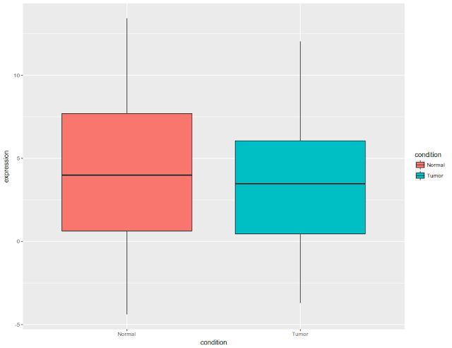
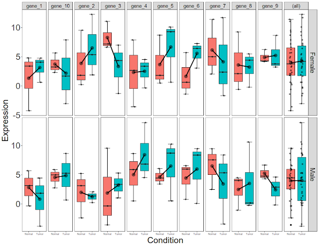
Post data analysis, a biologist is left with significant genes. These significant genes are associated with fold change, p-value. In addition, they are associated with covariates such as gender, disease state. There could be several other covariates that are associated with significant genes. Initial and final figures are below:
 and
Now let us simulate expression data for 10 genes with condition (disease state) and gender (male and female) as covariates.
#### Simulate data frame for 10 genes with condition and gender as coordinates
The data has expression values 10 genes and 12 samples.
```{R}
df1 = data.frame(genes = paste0("gene_", seq(1, 10)), matrix(sample(round(rnorm( 120, 4, 4), 2)), 10, 12))
colnames(df1)[-1] = paste0("sample", seq(1, 12))
head(df1)
```
#### Simulate phenotypic data
Phenotypic data (pheno) contains disease condition and gender status as covariates
```{R}
pheno = data.frame(
samples = paste0("sample", seq(1, 12)),
condition = rep(c("Normal", "Tumor"), each = 6),
gender = rep(rep(c("Male", "Female"), each = 3), 2)
)
```
Let us convert the experimental data (df1) into long format from wide format.
```{R}
library(tidyr)
df2 = gather(df1, "sample", "expression", -genes)
str(df2)
```
#### Now let us merge the data frames.
But we need to make sure that columns to be merged are of same kind and then merge it.
```{R}
pheno$samples=as.character(pheno$samples)
df3 = merge(df2, pheno, by.x = "sample", by.y = "samples")
head(df3)
```
Now let us explore the ways of display the data. First let us display the data. Then we will show in different ways of representation. Our final goal is to show the data as box plot. We can show the box plots by the type (either by gender or by condition). Once we display the data by category, then display the data error bars and connect the means by line.
#### Load library
```{R}
library(ggplot2)
```
#### Basic box plot for all the genes, for all the conditions and for all the genders.
Before that let us convert samples as levels.
```{R}
df3$sample = as.factor(df3$sample)
```
### Now plot all the data together as box plot
Plot the data as per condition.
```{r}
ggplot(df3, aes(x = condition, y = expression, fill = condition)) +
geom_boxplot(position = position_dodge(width = 1.1))
```
#### Now let us draw the connecting the lines
```{r}
ggplot(df3, aes(x = condition, y = expression, fill = condition)) +
geom_boxplot(position = position_dodge(width = 1.1))+
stat_summary(fun.y=mean, geom="line", aes(group=1)) +
stat_summary(fun.y=mean, geom="point", size=3)
```
#### Now let us add the error bars. Since R is lazy, let us draw error bars first and then other stuff.
```{r}
ggplot(df3, aes(x = condition, y = expression, fill = condition)) +
stat_boxplot(geom="errorbar", width=.5)+
geom_boxplot(position = position_dodge(width = 1.1))+
stat_summary(fun.y=mean, geom="line", aes(group=1)) +
stat_summary(fun.y=mean, geom="point", size=3)
```
#### Now let us draw the data over box plot
```{r}
ggplot(df3, aes(x = condition, y = expression, fill = condition)) +
stat_boxplot(geom="errorbar", width=.5)+
geom_boxplot(position = position_dodge(width = 1.1))+
stat_summary(fun.y=mean, geom="line", aes(group=1),lwd=1.2) +
stat_summary(fun.y=mean, geom="point", size=4, alpha=0.5)+
geom_jitter(width = 0.1, color="black", alpha=0.5)
```
#### Now let us beautify the plot. Remove the background, grid lines, change the x axis and y axis labels, hide legend and increase size of tick marks and plot titles
```{r}
ggplot(df3, aes(x = condition, y = expression, fill = condition)) +
stat_boxplot(geom="errorbar", width=.5)+
geom_boxplot(position = position_dodge(width = 1.1))+
stat_summary(fun.y=mean, geom="line", aes(group=1),lwd=1.2) +
stat_summary(fun.y=mean, geom="point", size=4, alpha=0.5)+
geom_jitter(width = 0.1, color="black", alpha=0.5) +
labs(x = "Condition", y = "Expression")+
theme_bw()+
theme(
axis.text.x = element_text(size = 24),
axis.text.y = element_text(size = 24),
axis.title.x = element_text(size = 24),
axis.title.y = element_text(size = 24),
panel.grid.major = element_blank(),
panel.grid.minor = element_blank(),
legend.position = "none",
)
```
#### Now let us draw these per gene i.e box plot each gene.
Remember these box plot for both the genders. We can separate as per gender in next step.
```{r}
ggplot(df3, aes(x = condition, y = expression, fill = condition)) +
stat_boxplot(geom="errorbar", width=.5)+
geom_boxplot(position = position_dodge(width = 1.1))+
stat_summary(fun.y=mean, geom="line", aes(group=1),lwd=1.2) +
stat_summary(fun.y=mean, geom="point", size=4, alpha=0.5)+
geom_jitter(width = 0.1, color="black", alpha=0.5) +
labs(x = "Condition", y = "Expression")+
theme_bw()+
theme(
axis.text.x = element_text(size = 12),
axis.text.y = element_text(size = 24),
axis.title.x = element_text(size = 24),
axis.title.y = element_text(size = 24),
panel.grid.major = element_blank(),
panel.grid.minor = element_blank(),
legend.position = "none",
)+
facet_grid( ~ genes,
scales = 'free_y',
space = "free"
)
```
#### Now let us draw box plots per gene per gender
We can separate as per gender in next step.
```{r}
ggplot(df3, aes(x = condition, y = expression, fill = condition)) +
stat_boxplot(geom="errorbar", width=.5)+
geom_boxplot(position = position_dodge(width = 1.1))+
stat_summary(fun.y=mean, geom="line", aes(group=1),lwd=1.2) +
stat_summary(fun.y=mean, geom="point", size=4, alpha=0.5)+
geom_jitter(width = 0.1, color="black", alpha=0.5) +
labs(x = "Condition", y = "Expression")+
theme_bw()+
theme(
axis.text.x = element_text(size = 9),
axis.text.y = element_text(size = 24),
axis.title.x = element_text(size = 24),
axis.title.y = element_text(size = 24),
panel.grid.major = element_blank(),
panel.grid.minor = element_blank(),
legend.position = "none",
strip.text.x = element_text(size = 14),
strip.text.y = element_text(size = 18)
)+
facet_grid( gender ~ genes,
scales = 'free_y',
space = "free"
)
```
#### Let us the add the summary expression of all genes at the end
```{r}
ggplot(df3, aes(x = condition, y = expression, fill = condition)) +
stat_boxplot(geom="errorbar", width=.5)+
geom_boxplot(position = position_dodge(width = 1.1))+
stat_summary(fun.y=mean, geom="line", aes(group=1),lwd=1.2) +
stat_summary(fun.y=mean, geom="point", size=4, alpha=0.5)+
geom_jitter(width = 0.1, color="black", alpha=0.5) +
labs(x = "Condition", y = "Expression")+
theme_bw()+
theme(
axis.text.x = element_text(size = 7),
axis.text.y = element_text(size = 24),
axis.title.x = element_text(size = 24),
axis.title.y = element_text(size = 24),
panel.grid.major = element_blank(),
panel.grid.minor = element_blank(),
legend.position = "none",
strip.text.x = element_text(size = 14),
strip.text.y = element_text(size = 18)
)+
facet_grid( gender ~ genes,
scales = 'free_y',
space = "free",
margins = "genes"
)
```