Skip to content
New issue

Have a question about this project? Sign up for a free GitHub account to open an issue and contact its maintainers and the community.

By clicking “Sign up for GitHub”, you agree to our terms of service and privacy statement. We’ll occasionally send you account related emails.

Already on GitHub? Sign in to your account

UI suggestions #38

Open
julianrichen opened this issue Jul 12, 2016 · 7 comments
Open

UI suggestions #38

julianrichen opened this issue Jul 12, 2016 · 7 comments
Milestone

Comments

@julianrichen
Copy link

julianrichen commented Jul 12, 2016

Hello, thank you for the application, it's working well so far.

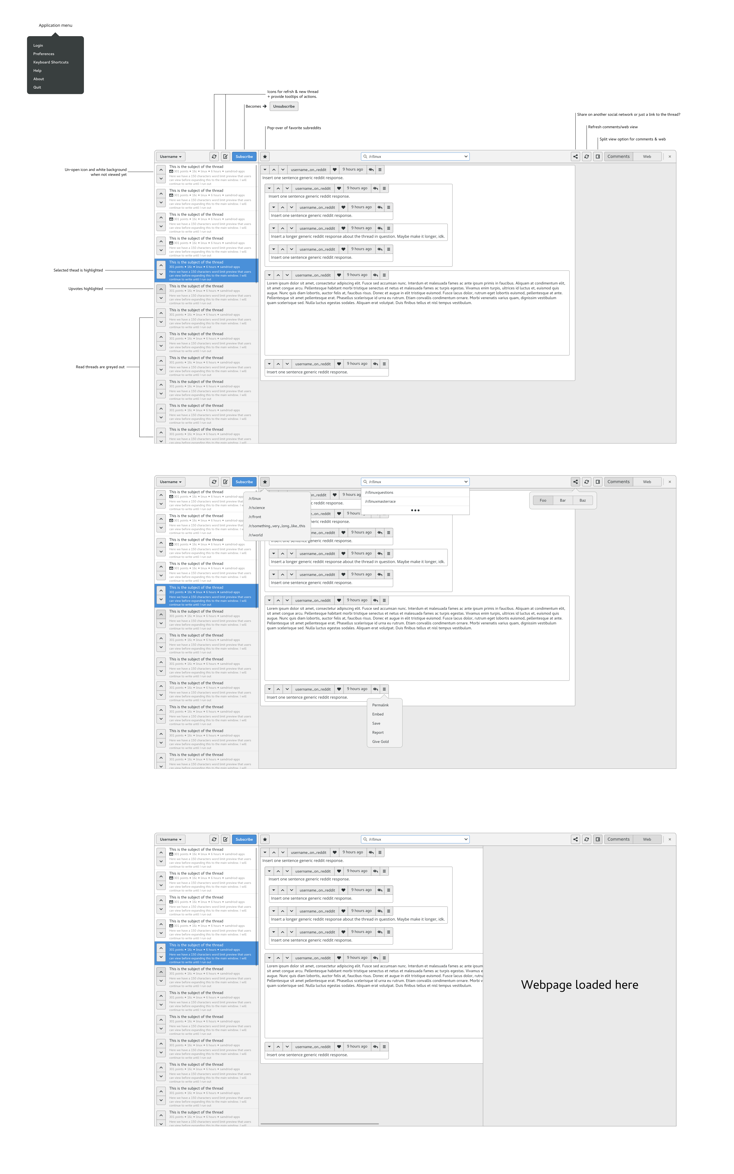
I wanted to suggests some improvements to the application, mostly to the headerbar and sidebar. I think it would be good to move the subscribe and submit buttons into the headerbar. This approach requires you to attached two Gtk.headerbars() to the window side-by-side. GNOME Tweak tools, GNOME Control center (the new one in 3.22) and a few more apps do this.

I also suggest some some change to the padding on a few elements using 7px for most spacing and 14px reserved for extra spacing (ex. between replies in the comments).

Few other feature ideas are a "split mode" which allows users to view the page and comments at the same time (refer to last window in the image). A Favorites button with a pop-over of popular subreddits the users visits (second window in image). And a share button with links to other social networks or simply the permalink to the thread.

The image is a bit larger so it might take a moment to load:
img
If the image fails to load here is a mirror, http://i.imgur.com/c297Sf2.png

@samdroid-apps samdroid-apps added this to the 1.0 milestone Jul 13, 2016
@samdroid-apps
Copy link
Owner

samdroid-apps commented Jul 13, 2016

Hi @julianrichen, beautiful mock-up! We're 100% doing this. This will be 1.0!

Feel free to send a pull request and put this svg in a "/designs" folder. We should keep this in tree.

Just a few questions:

  • How do we deal with user pages? User pages are in the sublist (left panel) but needs to display some metadata about the user (eg. their comment and link karma).
  • How do we deal with comments being displayed in the sublist (eg, user pgaes or /inbox)? Same as currently?
  • For the favourite subreddits list, we probably need a settings view right (to let the user sort and change what is displayed). Is that a modal dialog? How do we link to that from the popover
  • Do we put links to the user's inbox in their favourite subreddits list?
  • Do we need the "login" action in the application menu, or should it be accessable via pressing the username button?
  • Do you have any ideas about the way that user flairs are displayed, as well as the display of the "OP" and "MOD" stickers?
  • Where to thumbnails go in the new sublist design?
  • What is happening to the forward and back buttons for the webview? and the "open current page in external browser" button?
  • What are your thoughts on how the username popover should look? (what happens when you click the username button in the top left corner?)
  • What should happen when the comments top bar (the one with the username, upvote, downvote, etc) is too long for the window?

I'll start a list of TODOs for implementation:

  • Split headerbar
  • Implement new sublist design for links
  • Add favourites popover
  • Cool search suggestions for SubEntry/url-bar
  • Setup help infrastructure
  • Change PostTopBar to have the hamburger menu
  • Restyle comments view
  • Split view

@julianrichen
Copy link
Author

julianrichen commented Jul 13, 2016

How do we deal with user pages? User pages are in the sublist (left panel) but needs to display some metadata about the user (eg. their comment and link karma).

I would say if the search bar detects the search starting with /u/ or /user/ it changes the sidebar headerbar like so:
user karma and profile

This is a very rough draft, something doesn't fell 100% imo. I think we need icons to convey the link/comment karma buttons but I honestly can't come-up with an icon for karma (except the ying/yang), so....

How do we deal with comments being displayed in the sublist (eg, user pgaes or /inbox)? Same as currently?

I would say the current approach would work but when you click the thread in the sidebar it automatically opens the full thread. Honestly not really sure about this one.

For the favourite subreddits list, we probably need a settings view right (to let the user sort and change what is displayed). Is that a modal dialog? How do we link to that from the popover

I'm still learning python & gtk3 my self so I can't give you a 100% answer. Here is an idea for the favorite menu:
favorites menu

3 questions:

Do we put links to the user's inbox in their favourite subreddits list?
Do we need the "login" action in the application menu, or should it be accessable via pressing the username button?
What are your thoughts on how the username popover should look? (what happens when you click the username button in the top left corner?)

I was thinking this?
login

I'm also guessing doing a native login form is more effort then it's worth?

Do you have any ideas about the way that user flairs are displayed, as well as the display of the "OP" and "MOD" stickers?

I believe the first 4 comment bars in this image are the best approach. This is a bit hard because flairs aren't part of the "core content" (the post is more important) and so the GNOME approach would be to hide it in a menu or not show it. Users wouldn't want that hidden on Reddit so I would assume users using this application wouldn't either. This seems like an ok middle ground, as a users flair is less important then their username so it's smaller and below the username.
flairs

Where to thumbnails go in the new sublist design?

thumbnails

What is happening to the forward and back buttons for the webview? and the "open current page in external browser" button?

split view + share

What should happen when the comments top bar (the one with the username, upvote, downvote, etc) is too long for the window?

comment bar

~~ Bonus ~~
Start page:
start page

Updated the split view icon, nothing major but just keeping it up-to-date:
overall

@julianrichen
Copy link
Author

I have gone ahead an updated my previous post with all the unanswered questions + updated images.

@samdroid-apps
Copy link
Owner

One thing that I'm not quite sure about now is the placement of the urlbar and the username:

  • The url bar only affects the left panel, but it is in the right panel's header bar. Maybe it needs to swap over?
    • Does this make the left side to squishy? Maybe we need to take the other actions out of the headerbar - into a menu or something.
  • When the user is viewing a user page, it looks a little confusing to see their own username above the left panel. Maybe the user selector needs to move to where the urlbar is?

Actually, that is my other idea that I want to chat about - information density in the headebar. It looks very crowded. Can we really cut anything from the header bar?

Anyway, I have done a little of the implementation today for the header bar. Bit by bit, we will get there!

@julianrichen
Copy link
Author

These were also things bugging me but I continued as is to see if it could work. So I'm glad when you mentioned:

When the user is viewing a user page, it looks a little confusing to see their own username above the left panel. Maybe the user selector needs to move to where the urlbar is?

I think you are right about swapping the url bar. The url effects the left column so having it above the sidebar is logical. We could then swap the the user button (far left) to the right window next to the favorites icon, since they are similar. I would leave the refresh button in the left column headerbar next to the url bar but maybe putting the users profile information and a subreddit's submit & subscribe into the sidebar like it was before is better. We can just shrink it a bit.

I'll remake some mockups for the new headerbar with multiple layouts.

@julianrichen
Copy link
Author

I believe you are right, seems much cleaner and flows better:
something-for-reddit-headerbars 0 2 0

@samdroid-apps
Copy link
Owner

Ok, so I have started to get to ball rolling on this again. For a few reasons, I'm also re-writing the app in Vala - it is a beautiful language. I actually decided to start with the 1st run experience this time, because that doesn't get that much attention.

Check out the glade files (or just make it an run): src/sign-in-view.vala or src/sign-in-view.vala.

How does this look:

screenshot from 2016-10-22 23-22-35
Reddit mandated oauth flow:
screenshot from 2016-10-22 23-23-11
A few loading / error slides - they go by quickly.
It might be nice to have icons for the username, and it is kind of fun:
screenshot from 2016-10-22 23-23-50

Sign up for free to join this conversation on GitHub. Already have an account? Sign in to comment
Projects
None yet
Development

No branches or pull requests

2 participants