Different projections for different subplots? #211
Comments
|
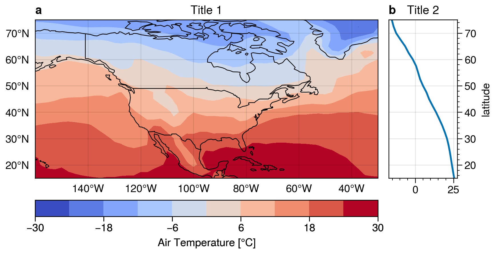
Hi @miniufo, it looks actually possible. I don't know if it is well-formatted for these kinds of plots with projections, but so far here are two examples that I succeded to make (one with and without panels): import proplot as plot
import xarray as xr
da = xr.tutorial.open_dataset('air_temperature').air.mean('time') - 273.15
fig, axs = plot.subplots(nrows=1, ncols=2, proj=('cyl', None), wratios=(5, 1), axwidth=4)

# First axis
ax = axs[0]
m = ax.contourf(da, cmap='CoolWarm', symmetric=True)
ax.colorbar(m, label='Air Temperature [°C]', loc='b')

ax.format(
   title='Title 1', coast=True, labels=True, borders=True, lonlines=20, latlines=10,
   latlim=(da.lat.min().values, da.lat.max().values), lonlim=(da.lon.min().values, da.lon.max().values)
)

# Second axis
ax = axs[1]
ax.plot(da.mean('lon'), da.lat)
ax.format(title='Title 2', xlabel='°C', ylabel='latitude', ytickloc='right', yticklabelloc='right')

# Format all axs
axs.format(abc=True)
fig.save('panel_1.jpg', dpi=300)
fig, axs = plot.subplots(nrows=1, ncols=1, proj='cyl', includepanels=True, axwidth=4)

# Plot
ax = axs[0]
ax.contourf(da, cmap='CoolWarm', symmetric=True, colorbar='b', colorbar_kw={'label': 'Air Temperature [°C]'} )

ax.format(
    title='Title 1', coast=True, labels=True, borders=True, lonlines=20, latlines=10,
    latlim=(da.lat.min().values, da.lat.max().values), lonlim=(da.lon.min().values, da.lon.max().values)
)

# Panel
pax = ax.panel('r', width=0.8)
pax.plot(da.mean('lon'), da.lat)
pax.format(ylabel='latitude', title='Title 2')

# Format all axs
axs.format(abc=True)
fig.save('panel_2.jpg', dpi=300)
Some small problems that I see:
I guess @lukelbd that develop this package could answer better than me on these small issues. Proplot version: 0.6.4 |


|
Hi @mickaellalande that is awesome! I've tried
|
I think it is just because the y ax is not "tight". If you add
Maybe there is a way to have ProPlot do that, though? |
|
Hi @zmoon and @mickaellalande, the misalignment of panels A and B is related to #79, #178, #199. Basically "axis sharing" is not possible between "geographic" plots like in your example, because "axis sharing" doesn't make sense for a lot of non-rectangular projections, and projections often have longitude/latitude labels on the top/right of subplots (proplot currently doesn't support sharing of labels on the top/right). In the future I plan to support axis sharing for simple rectangular projections like Mercator and Plate Carrée (as in your example). For now this issue duplicates those others, so I'll close it. As a workaround, set the latitude limits manually: import proplot as plot
fig, axs = plot.subplots(ncols=2, proj=('cyl', None)) # or ('cyl', 'cartesian')
axs[0].format(latlim=(15, 75))
axs[1].format(ylim=(15, 75))Also "panels" are excluded from the a-b-c labelling system -- that's intended behavior. |
I would like two subplots. The left subplot is plotted with a kwarg
proj='robin'while the right one does not needproj. This is sometimes common when the right plot is an (zonal) average of the left one. See the example below:If I use the following code:
Two panels will both use
proj='robin'. So is it possible to have some of the subplots useprojand keep the rest use the default (non-projection) plot?The text was updated successfully, but these errors were encountered: