The Platform for Typographic Discourse
In my proposals, I studied potential relationships between Hebrew and Latin characters. More specifically, I looked at character connections between the Hebrew and Latin script. Within the boundaries of both scripts those connections exist: ›n‹, ›m‹ and ›h‹ are structurally linked in the Latin script. And so I sought to find out whether characters or character fragments of both Hebrew and Latin are linked or can be linked. I discovered that while certain character groups bear the potential for new relationships, the modification of century-old letterforms and typographic conventions could be quite controversial. To read all about this process, refer to my proposal Cross-Script Character Relationships.
After submitting my proposals, I initially looked for the right medium to showcase my considerations. My thought was to create an interactive webpage where the potential character relationships could be presented. My focus soon shifted towards building a proper platform where I could showcase my considerations, but also enable others to respond to those considerations. This way, I thought, others might use the platform and make it their own, discuss their own type projects and ideas of how letter shapes might look like in the future.
My research has shown that the platforms where type designers discuss their work, are not designed specifically for typographic discourse. They are either forums designed for general discourse with typography being the core topic (e.g. typedrawers.com) or platforms designed for typography but not for discourse (e.g. futurefonts.com).
By opening up new ways of typographic discourse, this thesis pleas to challenge typographic conventions. It is not intended to suggest that the conventions we adhere to must all be thrown overboard. In fact, discourse may also reinforce conventions: There is a good chance that my proposal to establish new conventional character relationships between Hebrew and Latin will be vehemently critisized and rejected. And if, as Foucault puts it, the »will to truth« (1971, p.10) succeeds through the platform I am creating, all is won.
»The more things change, the more they stay the same.«
— Jean-Baptiste Alphonse Karr
To guide you through my thought process, I will first explain what conventions are (especially in the context of Latin and Hebrew typography) and why it is beneficial to question them from time to time. Next, discourse—the challenging of conventions—is elaborated on and prerequisites for discourse are established. This will lead me to the core of this paper, the documentation of the design and development of the platform Character Diversion—enabling people to discuss characters diverging from their conventional shapes as well as the character shapes of the fonts people design in general.
I will briefly recount my experiences modifying a number of typefaces according to my ideas of new character relationships and the process of showcasing them on Character Diversion. I will finish with an outlook to where Character Diversion could be taken to, which features are missing and in which scope the platform could actually be transformed form working prototype to a seriously used app.
According to Andrei Marmor (2009, preface, p. x), conventions are »rules that regulate human conduct«. He consitues that for conventions to develop one of the following three conditions must be met. (1) Conventions are social rules and are followed as a social fact. (2) There are practical reasons for people to follow certain rules. (3) The reason for obeying a conventional norm depends in part on others following it (Marmor, 2009).
Kulturelle Konventionen wirken sowohl auf subjektiver und intersubjektiver als auch auf struktureller und strukturierender Ebene. Sie sind beteiligt bei Prozessen der Kommunikationsbildung, d.h. der Produktion, Aushandlung und Zuordnung einer Bedeutung zu einem für kulturell gehaltenen Gegenstand, der Textualisierung und Diskursivierung von Kultur, sowie der Regelung der Teilnahme im soziokulturellen Feld.
— Büscher-Ulbrich, Kadelbach, Kindermann (HG.)
In the typographic sense this means that some conventions can be explained with practical reasons while others only make sense for the mere reason that a critical mass is following those conventions and breaking them would cause more loss than gain (example?).
The rhythm of ascenders and descenders in Latin script words, gives an often unique silhouette to those words improving their readability (source). Ascenders and descenders are letter shape convetions that have evolved over centuries and bring with them a very practical benefit that is still relevant todat.
Writing from left to right had practical reasons, too: the Romans adopted left-to-right writing direction among other reasons because with a majority of the population being right handed and using ink for writing, the right hand moving left would smear the ink (source). Today, where most text is written on a keyboard (source), this may not be an issue anymore, but because a critical mass has adopted writing the Latin script from left to right (i.e. 100%), changing this convention would be practically impossible.

[caption: Cippus Perusinus]
Finally, there are conventions of ornamentation, like the drop shaped tail of a Latin small letter ›y‹ or ›j‹. And while we got used to seeing those ornaments in serif typefaces, they are conventions that serve no practical reason and they breaking them would not cause chaos to the western world—they are because they have grown to be and just has they have come, they have the ability to go, if a critical mass chooses to.
The coventions of the Latin and the Hebrew script specifically were a major element in the research for my proposal »Cross-Script Character Relationships« and so the following paragraphs will reference a lot of this research.
The Latin and the Hebrew script both have their origins in the Phoenician script and while the Phoenician script is not used anymore, both Latin and Hebrew are alive and well. On their way to the 21st century they took very different paths, however. The two scripts developed distinct structural and typographic conventions. This differenciation began before typography itself was born as a consequence of the invention of the printing press in 1450 (Gunaratne, 2001).
The Jewish tradition perceived both the Hebrew alphabet as well as the language as sacred. This is one of the reasons for why in the second century BCE Hebrew started being used mostly as a liturgical and literary language (Britannica, 2021), while Latin spread with the expansion of the Roman Empire (source).
As previously mentioned, Latin used to be (like Greek and Etruscan and other Phoenecian descendant like Hebrew) written from right to left. As writing replaced chiselling, Latin adopted the baustrophedon style which meant it could be written both from left to right and from right to left. After the first century BCE almost all Latin inscriptions were written from left to right (Shores, 1965). Hebrew did not undergo this change in convention and remains written right to left, to this day.
Initially the character shapes of the Latin alphabet were mono-lined symbols with no stress and no serifs. This changed during the 1st century CE and the reason for this is mostly technical (Tselentis et al., 2012). The origins of serifs and stroke contrast, for example, are considered to lie in the Roman lapidary practice (i.e. the practice of shaping stone). Letters were painted on stone with a flat stiff brush—not a quill or a reed—and then chiseled into the surface (Friggeri, 2001). Hebrew characters developed stress and stroke contrast only more than a millennium later, and convened to a horizontal stress (as opposed to Latin vertical stress). The serif-like in-strokes (referred to as tags) in traditional Hebrew lettering, have technological origins, however different from Latin (Stern, 2003).
Many of those conventions were created and altered due to social and technological influences. Among other reasons, the Jewish people were scattered mostly around Europe, living in the diaspora and facing continuous persecution, which prevented them from adapting the scribal letterforms to the context of typesetting. This way, the refinements that were made to the Latin script following the invention of the printing press were not applied to Hebrew (Wittner et al., 2018).
»Everything must change for everything to remain the same.« — Giuseppe Tomasi di Lampedusa, The Leopard, 1960
The fact that some societies were subjected to the same technological innovations, yet they developed different conventions, could be caused by how some minorities adapt while others defend their heritage. Some immigrants hold on to their native culture to retain their identity and do so even more strongly than the people living in their home land (Kumar & Steenkamp, 2013). A mechanism of self-preservation the Jewish living in the diaspora surely applied. This may be yet another reason for why typographic conventions diverged even though societies lived side by side.
Conventions emerge in a dialectic process but are not always established because they are truly best practices. Sometimes they were established in times of quite different technological circumstance or for social reasons that may not apply today. Yet, some conventions are carried from generation to generation—consider the ink shaped tail of the letter ›j‹. But as our society strives for innovation, progress and adapting to new circumstances, our conventions need to change with us.
As previously established, some conventions are of great value today even if their practical origins are obsolete. But for a democracy to stay alive, the status quo needs to be questioned (source) and in this spirit I ask for typographic conventions to be questioned. Not with the intention of abolishing or changing them but to inspect them, see if they are still useful and if they could be replaced by more adequate conventions.
This process of challenging conventions can happen quite naturally, as it has for millennia. It can also be initiated intentionally and he next chapter deals with what is needed to do so.
If discourse is necessary to re-evaluate conventions, how can this discourse be enabled and encouraged? For discourse to emerge, three elements cannot be absent: (1) an issue, (2) opinions on the issue, and (3) a platform (on which people with opinions can discuss issues).

[venn diagram]
»Der Begriff ›Innovation‹ richtet sich [...] auf die Wirkung einer Neuerung auf ein entsprechendes System, eine Struktur, eine diskursive Formation oder ein soziokulturelles Feld.«
— Büscher-Ulbrich, Kadelbach, Kindermann (HG.)
In my proposals to this thesis, I explored the sociological impact of typographic hierarchies between the Hebrew and Arabic script in Israeli public space on the one hand and—as mentioned in the introduction—new potential character relationships between the Hebrew and Latin script on the other. Both topics are material for controversial discourse. Both orbit around multi script typography, about the possible implications of typographic differences between scripts and how we can alter typographic conventions to bring script closer together.
Without controversy, without the potential to disagreement there is no discourse. Everything else is non-discursive communication. This means that a platform for typographic discourse needs to be open to controversial proposals and encourage unconventional approaches (what is the consequence?).
For discourse to live, it needs participants who bring with them diverse opinions. This is why a platform for typographic discourse needs to be accessible. The more people involved in a conversation, the more likely it is that you'll get a variety of perspectives and ideas. And that's what makes discourse so valuable—it helps us understand one another better by giving us new ways to approach topics we thought we knew all about.
In order to make sure that discourse is inclusive and representative, you have to make sure everyone has access to it. For discourse to be alive, no one should feel excluded or marginalised because they couldn't participate for lack of access or because they didn't even know there was platform for this kind of typographic discourse in the first place.
In the original meaning of the word, discourse is described as an oral or written communication that goes beyond a single sentence. This also means that discourse is language-based communication. In many fields in which discourse is carried out, such as sociology, political science and anthropology, using language as the basis for communication seems quite adequate. And although typography is tightly linked with language, I have come to question whether discourse around typography should be based on language.
There are a number of platforms for typographic discourse, analogue conferences as well as digital forums, that have language as the basis of their discussions. That is not to say, that those formats are purely text based—in fact they are usually supplemented with imagery and specimen PDFs, but the exchange is based on language.
One of the great struggles of user interface design (frankly, of all design), is finding the balance between on the one hand predicting the user's needs, making smart decisions for them and consequently decluttering the interface and on the other hand giving them the feeling of agency and enabling them to accomplish their specific goals.
TypeDrawers is one of the most popular typography forums, spanning topics on Font Technology, History of Typography, and Type Design Critique. The fact that the design of the platform TypeDrawers seems to almost be oblivious to its content may be one of its greatest strengths and its weaknesses. While it does not force its users into the confines of too specific design, enabling them to use the platform according to their needs, the platform also lacks the tools to intuitively and interactively explore the discussions.

An adequate platform knows its users and knows the topics they discuss and finds a good balance between focussing the tools to what the user predictably seek out to do and leaving room for their particular use of the platform. In this sense, Character Diversion will be two things: a standalone platform that is simply very specific and a proof of concept for a potential plugin to already existing platforms missing this kind of discourse functionality.
As a standalone platform it has been designed specifically for critiquing letterforms and discussing their place in the future development of typography.
As a plugin, Character Diversion could eventually be implemented in a larger typographic forum with a preexisting community, giving it the possibility to upgrade lively type communities with a tool for very specific type discussions.
The world of typography lives on discussion and debate. Designers speak about fonts in conferences, creative studios, and online forums. And those discussions have advanced the typographic discourse for decades. There is discourse in the world of typography but the platforms do not always provide the appropriate environment and tools.
Character Diversion can help get a better picture of how people think about certain design decisions, show where people agree and disagree, and link those opinions with the character shapes they refer to. This way, Character Diversion, creates a better overview over the conversation and with visual referencing enables a more intuitive approach to typographic discourse.
In this attempt to build a platform that facilitates typographic discourse, I put my attention to what this discourse needs and what existing platforms are missing. To achieve this, I distinguish between two kinds of discourse: (1) type design critique and (2) fundamental questions of where we want to take typography going forward. The former is predominantly led by independent type designers, students and enthusiasts (source?). The latter lives mostly in conferences on type.
- Design Critique
- What exists?
- What is missing?
- Societal Discourse
- What exists?
- What is missing?
--
So I set out to design and develop a platform for people to discuss all typographic topics that can be linked to a specific font file. This linking is meant to
Character Diversion is a platform for typographic discourse. Accordingly, typography and discourse should lie at the heart of the application.
User experience and interfaces need to communicate clearly what the app does and how to use it.
[note] It is common practice in Web and UX/UI Design to design mobile first. That is to say, design the structure and layout of a platform for the mobile experience first and then adapt to larger screens. The reasoning behind this is, that the majority of users will access the app on a mobile device and thus the platform should be designed of those users first. Character Diversion was not designed mobile first: it is in fact intended to be a tool for professionals, working on their desktop computers and accessing this site through this desktop. This is why Character Diversion is—for the moment—desktop first.
With all this talk about moving away from language based discourse towards a typography based discourse, the letter shapes needed to be at the literal center of the platform. The glyphs serve either as an entry point into the discussion, or as an illustration and reference. This way, opinions and the design they are referring to are interlinked in two ways and both can be accessed through one another. However, more on that later.
The discourse panel is separated into three views: about the font, glyphs, discourse [note]. All three views have elements linking to another one of the views. The about view shows discourse title, author, font info, version history, and other meta data. The glyphs view shows an overview over the glyphs the respective font contains and the discourse view shows the list of opinions.
[note] Initially, the discourse panel was one view, containing discourse description, opinions and glyphs. And while there is a certain appeal to having all the information at your finger tips, the interface was cluttered and most importantly the user experience was not clear. Filtering glyphs while writing an opinion caused conflicting behaviour when selecting an opinion, which would, again filter the referenced glyphs.
| title | About | Glyphs | Discourse |
|---|---|---|---|
| visible | Font Title, Author, Version History, Sample Text (with annotations) | A, B, C, D, E, ... |
List View of Opinions |
| ability | Get overview over font project | Inline access to Opinions | Access to Glyph (group Preview) |
In the glyphs view, each glyph that is referenced in an opinion, shows a little annotations which, clicking on it opens a popup with the corresponding part of the discourse. The discourse view links to the glyphs by opening a preview of the referenced glyphs (and their state) when clicking on the opinion. Lastly, in the about panel, the characters in the preview text are annotated and linked to the corresponding opinions.
When I started with the design, opinions were merely comments, connected to glyphs and axes spectra. In the spirit of Jeff Atwood's comment about Stack Exchange (2013), I had to consider how this element needed to be designed. Should opinions be forced to be concise and efficient by limiting the richness of the editor and reorganising the ordering through a voting system? Or would this limit the liveliness of the discourse?
»At Stack Exchange, one of the tricky things we learned about Q&A is that if your goal is to have an excellent signal to noise ratio, you must suppress discussion. Stack Exchange only supports the absolute minimum amount of discussion necessary to produce great questions and great answers. That's why answers get constantly re-ordered by votes, that's why comments have limited formatting and length and only a few display, and so forth.« (Atwood, 2013)
I decided that opinions in fact needed more prominence.
After setting up the discourse project, the first step in actually engaging in discourse, is for people to share their opinions. So the implementation of opinions on type design begs the question of what users want to actually do (on top of simply sharing their opinion in written form) and how they would most intuitively try to achieve that.
There are several approaches to this problem:
- Users type their opinion and before posting it are presented with a (filterable) list of glyphs as well as, if applicable, range inputs for setting the spectra of the variable font axes.
- Current convention of denoting letter reference with a forward slash (/) is made use of and referenced letters are recognised from the text of the opinion and automatically linked.
I decided to draw from both options: for this I created a lookup table for glyphs through which I can access all glyphs by entering either the literal glyph (/א), the postscript name of the glyph (/alef) and a name with a stylistic set extension (/alef.ss01). It also works on complex alternatives like /braceleft.case.ss01.
{
	'א': {
    glyph: SamsaGlyph {
      id: 54,
      name: 'uni05D0',
      font: SamsaFont { ... },
      numPoints: 48,
      numContours: 1,
      ...
    },
    literal: "א",
    name: "uni05D0",
    postScript: "alef",
    unicode: "1488",
    unicodeHex: "05D0"
	},
	'alef': {
    glyph: SamsaGlyph { ... },
    literal: "א",
    name: "uni05D0",
    postScript: "alef",
    unicode: "1488",
    unicodeHex: "05D0"
	}
}
Another question that emerged was how to deal with the situation that a user wants to voice their opinion on several glyphs referencing them in a comment but saying distinct things about each of the glyphs. By default, all referenced glyphs are linked to the whole comment. Considering it is a lengthy comment referencing ten or more glyphs, the quality of the tool, the precise linking of opinions to glyphs is lost.
This could be tackled by indeed selecting an opinion and thus filtering the glyphs, and then highlighting specific glyphs by hovering over each reference or paragraph. The usability of this idea needs testing.
A core feature of Character Diversion is the ability to browse either the glyphs or the opinions and find the respective opinions on glyph or glyphs an opinion is referring to. The user experience (and almost just as importantly the underlying structural considerations) were not at all trivial.
The initial logic was to have the list of opinions on the right and the grid with all the glyphs on the left. Opinions can be selected to expand their content and show meta data like the set variable font axes and the selected glyphs within the opinion card. Selecting the opinion should, however, also bring the referenced group of glyphs with the corresponding markings highlighted and the referenced spectrum or location on the variable font axis to the attention of the user. This means that if a user wanted to say something about the bottom and top intersections of the /$ at value 800 and up on the wght axis and they would mark the location of the dollar sign at 800 wght while writing their opinion, anyone viewing this opinion should be see a large bold (800) dollar sign, with highlighted markings in the appropriate locations.
This functionality alone, is straightforward conceptually and almost just as straight forward in its implementations: the grid of glyphs is either filtered so that only the glyphs corresponding to the selected opinion remain or a new tab or popup is opened where glyphs corresponding to selected opinions are shown.
When implementing this functionality into
By default, opinions are sorted by their voting score. Very recent opinions are pushed to the top as well, not to be displaced by very popular opinions right from the start. This way, new potentially popular opinions have the chance to be seen not only after scrolling all the way to the bottom.
One goal of the platform is to create overview. In order to do that, the possibility of a large amount of opinions and comments needs to be taken into account. Opinions need to be filterable and sortable by date, votes, and tags.
Threads are sub-conversations that can evolve below a comment. They can be very helpful in multi-faceted conversations with many participants. Threads can, however, also reduce the overview over a conversation, and lead away from the topic.
A question that came up was whether to consider comments below opinions as another kind of data, or to trat comments like opinions that are linked to other opinions.
The overall visual aesthetics are kept in a flat design, with a beige palette, and a bright orange and blue as accent colors. The platform does not need to sell anything, persuade anyone. In fact, it succeeds, when it remains unnoticed—adapted freely from Lucius Burckhardt's Design is invisible (2017). And yet, the visual appearance is not arbitrary: with the muted beige, I reference paper as the home of typography.
...

Another form of visually referencing what a user is critiquing, is marking elements in a glyph and linking it to a particular opinion. A glyph can have multiple marks that are all linked to their corresponding opinion.
As established before, discourse thrives on differences of opinion. A vital feature for Character Diversion is responding to opinions with the option to agree or disagree.
Today, many social media platforms offer the possibility to react to content in many differentiated ways. The like buttons seemed to cause issues when people were posting about tragedies and followers were unsure if to like or not to like, when clearly they were not happy about the tragedy but wanted to show support. This seems to be no issue here, however and so I decided to implement a very simple voting mechanism—you can vote up or down. The vote can then be interpreted by the users as agreement, relevance, helpfulness and used for spotting important popular opinions and sorting opinions by popularity.
The current design of the platform requires users to upload font files in order to refer to certain characters. The reality in typographic discourse is, however, that some questions orbit around typefaces that have not font files or the licensing disallows the upload of font files. Currently, those discourse are held by uploading imagery and even drawings of letterforms.
A potential future feature of Character Diversion could be the option to upload an image instead of a font and have to app automatically detect the letters, assign them to their Unicode symbol and allow users to associate opinions with those letters. This way a core functionality of Character Diversion would be extended to wide range of use cases.
As of writing this, Character Diversion does not support multiple font files or multiple font instances like Light, Regular and Bold.
With the support for variable fonts, ...
When implementing the platform into the design process of a typeface, versioning is indispensable. It is very common for a process involving design critiquing to involve versioning. A designer may upload a project font, commentators propose changes and the designer implements those changes. If there are 50 comments and the designer solves 20 of them in one round and tweaks another 15 in another go, how can those changes be kept track of? Do the opinions that were tackled become obsolete? And what is the workflow for marking those that become obsolete? Is it technically feasible to integrate an automatic change detection like the versioning control system Git or would each opinion need to be marked as obsolete? In addition to the management of obsolete comments, some sort of timeline would need to be added to look back at prior versions to comprehend the development.
Due to its complex implementation, this feature may, however, be developed in the future.
The app is divided into three main areas represented by links in the main navigation of the platform: Home, Discover and Profile.
Home, Discover, Profile
Character Diversion is written in TypeScript, a strongly typed programming language that builds on JavaScript. It is a language that helps developers build their projects and spot bugs before their occur in a production site or app. There is a lot that can be said about TypeScript—relevant to this paper is that it enables the developer to define data object structures and peek at those structures in the development process. It also helped me understand how discourse and opinions need to be structured and references. I will illustrate the structure of discourses and opinions in the same way their are defined in the project.
export interface Discourse {
  id: string
  attributes: {
    title: string
    content: string
    font: string
    author?: Author
    createdAt?: string
    publishedAt?: string
    updatedAt?: string
    opinions?: Opinion[]
  }
}
While lowercase types like number or string are primitives, types with an uppercase starting character like Discourse or Opinion are interfaces referencing an object type. Empty brackets after a type ([]), signify an array of the type. In the Discourse interface, opinions is typed with Opinion[] referencing the Opinion interface. A question mark after the key (?) makes this key optional to an interface (TypeScript Documentation, 2022).
export interface Opinion {
  id: string
  attributes: {
    content: string
    author?: Author
    createdAt?: string
    publishedAt?: string
    updatedAt?: string
    responseTo?: number
    responses?: number[]
    glyphs?: number[]
    votes?: Vote[]
    annotations?: {
      [id: number]: Annotation[]
    }
    axes?: {
      [tag: string]: number[]
    }
    activeAxes?: string[]
  }
}
export interface Author {
id: number
createdAt: string
email: string
name: string
username: string
role: object
avatar: object
}export interface Vote {
author: string
value: number
createdAt: string
}export interface Annotation {
x: number
y: number
type?: string
opinionId?: string
}A major question to overcome was the structure of opinions and how to design the interface.
Because of the scale of the project as well as my own skill set, I decided to build a web app instead of a native app. A native app needs to be specifically designed for macOS, Windows, iOS or Android etc. which you would download onto your device, while a web based app is basically a website that behaves almost like native app. Building a web app requires you to build only one (1) app, whereas when designing natively you may end up developing several apps for each platform (i.e. iOS, Android etc.).
This means that Character Diversion is build with HTML, CSS, and JavaScript. More specifically, I used the open source JavaScript framework Vue.js (writing TypeScript and implemented with Nuxt.js) to build the front end application and the headless open source CMS (content management system) Strapi for the Node.js backend. This is to say that a lot of modern web technologies were used to make the user experience (as well as the developer experience) as smooth as possible, allow for asynchronous interaction and the ability to install Character Diversion as a PWA (progressive web app).
For the longest time, it was common practice in web development to separate markup (HTML), styling (CSS) and functionality (JavaScript) (source). All styles would be written in a large CSS file and the same would be done with JavaScript.
In recent years there has been a paradigm shift, however, towards a component based approach. In this approach, a website or an app would be divided into smaller elements and then the markup, styles and functionality for each element would be stored in a separate file. Like many JavaScript frameworks, Vue.js uses a component based approach to front end development.
A component is usually a generic shell which accepts data that will populate this shell.
// CustomButton.vue
<template>
	<button :style="`color: white; background-color: ${color}">
    {{label}}
  </button>
</template>
<script>
  export default {
    name: 'CustomButton',
    props: ['label', 'color'],
  }
</script>
// App.vue
<template>
<CustomButton color="#ff0000" label="Text in Button" />
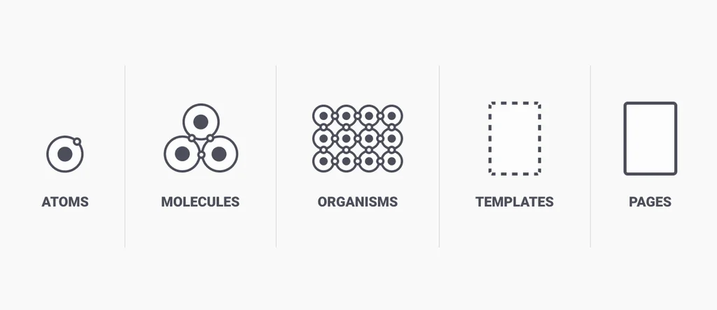
</template>One particularly appealing concept is the atomic design system, introduced. It is constructed from atoms, which form molecules, which in turn form organisms which live in templates and pages. In a UI context a button and a text input field can be understood as atoms and when put together to a search field they become a molecule. This molecule of a search field can be embedded into the organism of a header, side-by-side with a logo atom and a main-menu molecule. This organism of a header can live in a template or a page.
When starting this project, I set up a GitHub repository named lnvglr/character-diversion. GitHub is a platform for hosting source code. GitHub uses the version control system Git to track changes to the source code. It is mostly used for collaboratively working on projects but it is also used for automated deployment processes.
For this project I used the repo (short for repository) to track my changes and to have the ability to go back in time and see my progress as well as making the project open source.
When Character Diversion started taking shape, I used a platform that would allow for me to deploy the code and to make it accessible to the public. Heroku offers Node.js hosting, so I deployed both my Straps backend and my Nuxt.js frontend on Heroku.
I chose a way of cross referencing the two pillars of this thesis. I built a platform to showcase my considerations on non-conventional character relationships between Hebrew and Latin. And at the same time I am using the non-conventional character relationships to showcase the usability of the platform I built.
The design and architecture of the platform has already been discussed at length. And most of my considerations on non-conventional character relationships have been played out in my proposal Cross-Script Character Relationships. In this chapter I will give a brief account on the implementation of my considerations and the experience of uploading the project to Character Diversion.
I decided to reduce my modifications to two character relationships: (1) the Psiah/Tail connection between the Hebrew letter tav (›ת‹) and the Latin small letter ›j‹, (2) the shoulder of the Latin letters ›n‹, ›m‹ and ›h‹ as well as the Hebrew letters ›ב‹, ›ה‹, ›ח‹, ›כ‹, ›ך‹, ›מ‹, ›ם‹, ›פ‹, ›ף‹, ›ר‹, ›ת‹.
Having two types of character relationships meant I would need two axes in the variable font: PSIA (Psiah[1]) and SHLD (Shoulder) [2]. The first typeface I modified was Fedra, by type designer Peter Biľak, a typeface with beautiful letter forms both in Hebrew and in Latin. Fedra has a noticeable stroke contrast and the stress angle of the Hebrew is conventionally perpendicular to that of the Latin letter forms. This had implications as to how reusable components would be across the two scripts.
[1] Psiah is the what the tail of the Hebrew letter tav is referred to.
[2] Variable fonts can contain more axes than anyone would (probably) ever need. The axes have 4-character tags that are used to set their CSS values. There are five registered axes, their tag is, by convention, written in lowercase letters, while the tags of custom axes are written in all caps.
Registered axes
| Axis name | Axis tag |
|---|---|
| Weight | wght |
| Width | wdth |
| Slant | slnt |
| Optical Size | opsz |
| Italics | ital |
I made a copy of the bold weight font file of Fedra and opened it in the font editing software Glyphs. Since the two axes Psiah and Shoulder do not apply to all characters, I did not set up regular master layers. Instead I used Virtual Masters which are masters that can be applied to selected glyphs. This meant that depending on whether a certain character was affected by both axes, one axis or no axis had an impact on how many masters this particular character would have. While the Latin letter ›j‹ was only affected by the Psiah axis resulting in two master for two extremes, the Hebrew letter tav (›ת‹) was affected by both axes, resulting in four masters for all possible combination of extremes.


As can be seen in figure (x and y), the linked character fragments do not share the same exact component. In fact, the proportions of the fragment are quite different—and for good reason. With the modification of Fedra, I did not change the entire set of glyphs and so I needed to stick to the stress angle of each script. It is for the Hebrew letters a horizontal stress and for the Latin letters a vertical stress. This meant that the Psiah of the Hebrew Tav (›ת‹) is narrower and has a thicker ›foot‹ than the corresponding Latin letter ›t‹.
At the core of the modifications lies the idea that those newly established character relationships could potentially become conventional, meaning a certain level of predictability is involved. Multi script typefaces with character sets of both Hebrew and Latin script would predictably treat inter-script character groups similarly. The Latin ›j‹ and the Hebrew Tav (›ת‹) would consistently behave similarly. The Tav could look more like the original Jay or the Jay could tend more towards the original Tav—either way, both would look as though there is some inherent connection.
To demonstrate this, I implemented a Hebraised and a Latinised version in the two extremes of a variable font axis. This implementation and usage of variable font technology is primarily for demonstration purposes [note]. For the purposes of this project, however, moving the axis would not enable the users of the font to determine the character shape for later use but instead to see certain cross-script character groups change, signifying the newly established relationship.
[note] The idea to design fonts with many variable font axes and using those axes not for changing generic parameters but for fluidly changing ornaments and treatment of serifs is quite intriguing.
In my research on latinisation of Hebrew typography, I came across The New Hebrew Typography by Hugh J. Schonfield. It is an attempt at reimagining the Hebrew typography way beyond the bounds of typography. Not so much did he develop a typeface or range of typefaces, he developed new conventions for the Hebrew script, heavily inspired by the Latin script. He implemented a cameral system, giving Hebrew lower case characters, he removed the five final forms (›ך‹, ›ם‹, ›ן‹, ›ף‹, ›ץ‹), added vertical stress and real serifs (different from the already existing tags).
Most of what I could find about The New Hebrew Typography were rants about how terrible the ideas were, how illegible the letter forms and—quite frankly—how low the quality of execution. What I could not find, was a constructive inspection of each letter, each consideration and discourse about the considerations driven by the Hebrew type design community.
This experience was another bit, which inspired me to work on this project. The notion that some ideas, however wild and unpopular they may seem at first, at least deserve a platform to be discussed. For this reason I uploaded to Character Diversion a font designed after the principle of The New Hebrew Typography.
The working
Exploring the design of a software for typographic discourse, I discovered a number of shortcomings.
It lies in the nature of things, that specificity and specialisation enables users to do one thing very well.