Make it easier to reach rooms belonging to a space #3078
Description
Is your feature request related to a problem? Please describe.
Users coming from other chat applications (Like Whatsapp or Telegram) are used to have all their conversations in plain view. Element has traditionally made it more complex, by splitting conversations into two different tabs (DMs and Rooms). Because of this, I have already received complaints from casual users who weren't able to find a conversation they had with me.
However, the addition of spaces brings a new layer of complexity. If I share a room with a family member, and that room belongs to a space, that person needs to take the following steps in order to find the room:
- Click the Home button at the top-left corner, which is already unintuitive because there's no clue that it's even clickable.
- Scroll, find and click the corresponding space.
- Click the Rooms tab.
- Find and click the room.
I'm worried that this will be too cumbersome and unintuitive for casual users, and I'd like to propose an alternative solution:
Describe the solution you'd like.
Instead of a navigation drawer, I would use a filter bar similar to the one used by other apps like Google Play Books. Here's a mockup:
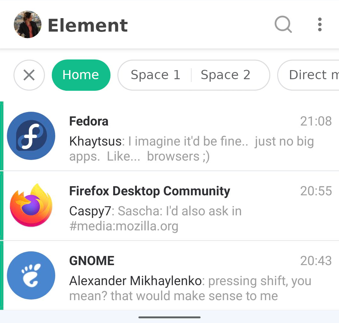
In my mockup spaces are always shown on the filter bar at the top, giving the user a clear graphical clue that they're there. Home is selected by default, but any other space can be clicked at any time in order to change the set of rooms that are shown.
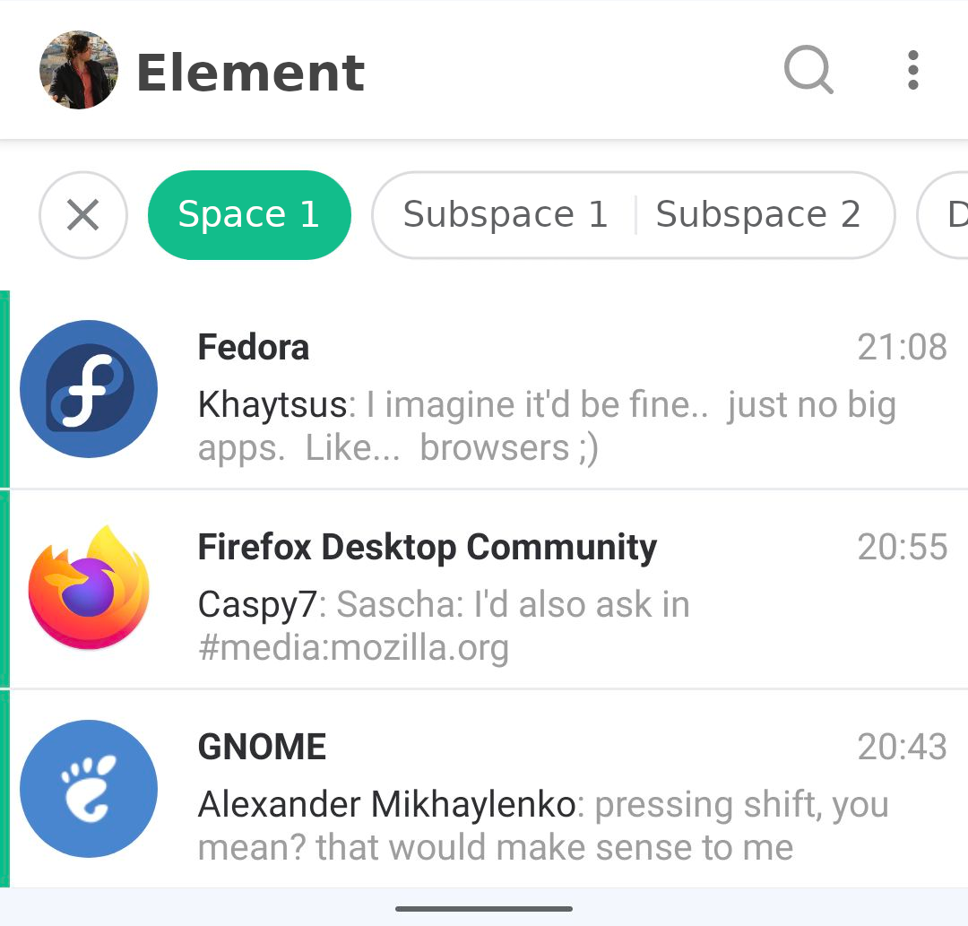
What about subspaces?
My design also takes care of them. When the user selects a space, all subspaces belonging to it appear to the right and can also be clicked. Here's a mockup:
The same applies to sub-subspaces. When the user selects a space, al sub-subspaces belonging to it appear to the right:
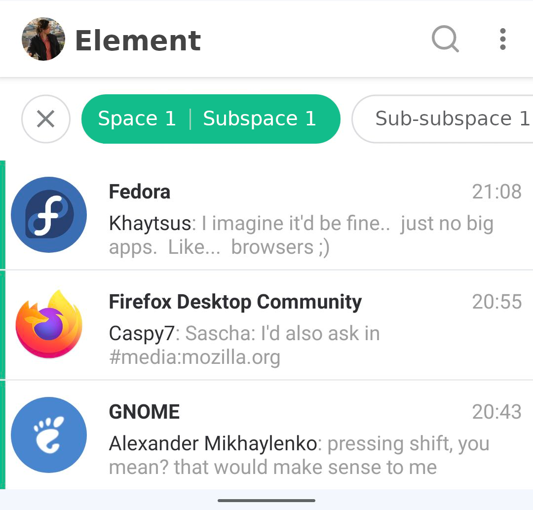
This can go as deep as needed, regardless of how many levels the user's tree has. Which in my opinion also makes it more suitable than the navigation drawer for some power users.
In my opinion, the main advantages of this design are that:
- Spaces are always in plain sight, as opposed to hidden in a navigation drawer. This is important when the user wants to find a room, but also when a space has notifications that require attention.
- Spaces can be reached more easily, with just one click as opposed to two.
- Subspaces are also easier to find and reach, because of the same reason.
- It might be difficult to show deeply nested spaces in the navigation drawer, but there's no such problem here.