Skip to content
New issue

Have a question about this project? Sign up for a free GitHub account to open an issue and contact its maintainers and the community.

By clicking “Sign up for GitHub”, you agree to our terms of service and privacy statement. We’ll occasionally send you account related emails.

Already on GitHub? Sign in to your account

[feature request] Specify marker locations on the plot #43

Open
kaushalmodi opened this issue Feb 19, 2020 · 7 comments
Open

[feature request] Specify marker locations on the plot #43

kaushalmodi opened this issue Feb 19, 2020 · 7 comments

Comments

@kaushalmodi
Copy link

kaushalmodi commented Feb 19, 2020

Hello,

I was compounding a related feature request in the "annotation feature request" issue. So instead I broke it out to this separate issue.

Can the A, B, C, D, E points put as some kind of markers on that line plot in your example?

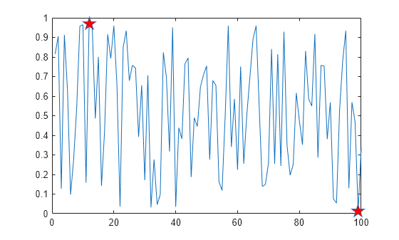
.. something like the star markers that a user might choose to place in this MATLAB example (see below): https://www.mathworks.com/help/matlab/creating_plots/create-line-plot-with-markers.html#bvcbmly-1

Originally posted by @kaushalmodi in #37 (comment)

@Vindaar
Copy link
Owner

Vindaar commented Feb 19, 2020

For the time being I'd propose to just do this manually.

You can do that by selecting the data you want to highlight and then adding another geom and explicitly only using that data.

NOTE

Ok, while testing just this, I noticed a regression in the below. Namely, the color of the specific markers is overridden by the coloring given by the classification of the two channels.
edit2: I should mention: in this case the additional geom_point inherit the aes from the ggplot call. That means x = "in_s", y = "V" and also color = "Channel". So with the plot below it's not necessarily wrong that these points are colored in blue. However, the actual regression is that adding an aes = aes("in_s", "V") arg to each geom_point should get rid of that classification. And that isn't working right now.

Using one of the recipes as an example, let's say we want to highlight min and max of channel 2 below:

import ggplotnim, algorithm

let df = toDf(readCsv("data/50-18004.CSV"))
  .gather(["C1_in_V", "C2_in_V"], key = "Channel", value = "V")
# filter to Channel 2 and sort by voltage
let dfSorted = df.filter(f{"Channel" == "C2_in_V"})
  .arrange("V", SortOrder.Descending)
# get min and max
let dfMax = dfSorted.head(1)
let dfMin = dfSorted.tail(1)
ggplot(df, aes("in_s", "V", color = "Channel")) +
  geom_line() +
  # add additional geom with `data =` arg
  geom_point(data = dfMax,
             color = parseHex("FF0000"),
             size = 5.0) +
  geom_point(data = dfMin,
             color = parseHex("FF0000"),
             size = 5.0) +
  ggsave("custom_annotate_marker.png")

Which gives us the following plot:

custom_annotate_marker

Aside from the aforementioned regression, this is lacking in another regard: at the moment the geom_point proc does not expose the different marker styles.
Well, at the moment though only a point and a cross is implemented anyways, see here for the MarkerKind:
https://github.com/Vindaar/ginger/blob/master/src/ginger/types.nim#L63-L64
and the actually implemented ones:
https://github.com/Vindaar/ginger/blob/master/src/ginger.nim#L2424-L2451
(OMG, I need to clean up ginger and ggplotnim 🙈)

So.. aehm, if you like drawing "cairo style" feel free to implement as many marker kinds as you like, haha.

I'll finish up that annotation PR first and then take a look at the performance issue. A more convenient highlighting of points will come later at some point. :)

@Vindaar
Copy link
Owner

Vindaar commented Feb 26, 2020

Ok, I just thought a bit about the regression I mention in the last post.
(Well, this turned out longer than I thought. Sorry for hijacking this issue somewhat, haha. I didn't want to open a new one, since it's directly related to achieve my interim solution).

The problem

Strictly speaking what I call a regression above is one, but from a practical standpoint it's the desired behavior I would argue. A reduced and clearer example:

ggplot(df, aes("in_s", "V", color = "Channel")) +
  geom_line() +
  geom_point(data = dfMax,
             color = parseHex("FF0000"),
             size = 5.0) +
  ggsave("test.pdf")

This should result in a plot with multi colored lines and the maximum point shown as a large circle in the given color. I mention above that the geom_point call inherits the aes from ggplot. That is true. Now I could change the code such that by adding an aes argument to geom_point the result would be to only use the aes given. That would then lead to the deactivation of e.g. color if the arg was aes = aes("in_s", "V").

However, by doing this we would rob us from being able to just set a single column differently, e.g. if we have columns x, y, y2 and the ggplot call contains aes("x", "y") we could no longer add a second geom with aes = aes(y = "y2") without also specifying the x argument again, despite it not changing.

By design there does not have to be a way to undeclare an aes that was already given to ggplot. If an aes is not to be defined for all geom, then it shouldn't be part of the ggplot aes in the first place.

Also implementing this behavior would require rethinking the "inheritance logic" for the aes (which is currently done by a set of uint16, where each geom gets a unique id; yeah, this is bad if you want to create 65536 geoms in one program...).

The alternative

What I did not consider in the above example, is the obvious. If the user hands a specific color, size etc. Any customization argument, we better use it!

To properly handle this I need to change the Style that's used internally. At the moment that is just an object from ginger, which stores all possible styling attributes (size, color, fillColor, markerKind, lineType, lineWidth).

I'll introduce a ggplotnim specific style object instead, which stores Option[T] for each field. If the user hands a style it'll be a some. If it's a none we use a default style during the plotting phase. This allows us to check for user args during the creation of all final FilledGeom elements.

@kaushalmodi
Copy link
Author

kaushalmodi commented Feb 26, 2020

Now I could change the code such that by adding an aes argument to geom_point the result would be to only use the aes given.

I got confused by that, but then I saw in https://vindaar.github.io/ggplotnim/#geom_point%2CAesthetics%2CColor%2Cfloat%2Cstring%2Cfloat%2Cseq%5BT%5D%5Bfloat%5D%2Cstring%2Cstring that geom_point also has aes param :)

So you can specify the color using the color param or via aes.color param? But if I understand it correctly, if user specifies an aes arg, it completely overrides the aes from the parent ggplot, right?

I'll introduce a ggplotnim specific style object instead, which stores Option[T] for each field. If the user hands a style it'll be a some. If it's a none we use a default style during the plotting phase.

That's a nice idea.. Can then the color param to geom_point (and others) be deprecated?.. may be have just aes to override the aesthetics (as the name says)?

@Vindaar
Copy link
Owner

Vindaar commented Feb 26, 2020

Now I could change the code such that by adding an aes argument to geom_point the result would be to only use the aes given.

I got confused by that, but then I saw in https://vindaar.github.io/ggplotnim/#geom_point%2CAesthetics%2CColor%2Cfloat%2Cstring%2Cfloat%2Cseq%5BT%5D%5Bfloat%5D%2Cstring%2Cstring that geom_point also has aes param :)

So you can specify the color using the color param or via aes.color param? But if I understand it correctly, if user specifies an aes arg, it completely overrides the aes from the parent ggplot, right?

No, you have to differentiate between the aes and between simple customization. The aes (the "aesthetic") refers to mapping a data column (the argument given to an element of the aes call) to a scale. A scale in this context refers to one of the following:

  • a data scale (x, y)
  • a color scale (color, fillColor)
  • a size scale (size, lineWidth)

This means each value in the given column refers to a value on the desired scale, which is used to customize the appearance or location of a geom to be drawn.

(As an aside: You can also assign a string, which is not a DF column and it'll use that as a dummy value. In effect this gets you a legend for those set values and a unique style for them. In the future this should be extended to formulas etc., so that one can say things like aes(y = toKmh("speed / mph")) to avoid having to perform sometimes trivial calculations on the DF beforehand. There's better examples, I just can't think of them right now)

On the other hand customizing the appearance without an associated scale is what's called setting a style. This is done via the direct color, size, etc. arguments. That is also why we cannot deprecate those arguments (see below).

The final style a point, line etc. will have is thus a combination of mappings and settings.

My confusion was simply that I didn't think about the priorities before. In practice the user will usually only define mappings on the data. However, if they do provide a setting that probably means they want to override a specific mapping for something. And that should be possible (and it doesn't work correctly right now).

I haven't completely read it right now, but I think this article explains a little more about the difference of mappings and settings in ggplot2:
https://www.r-bloggers.com/ggplot2-mapping-vs-setting/

I'll introduce a ggplotnim specific style object instead, which stores Option[T] for each field. If the user hands a style it'll be a some. If it's a none we use a default style during the plotting phase.

That's a nice idea.. Can then the color param to geom_point (and others) be deprecated?.. may be have just aes to override the aesthetics (as the name says)?

As mentioned above, that's not really possible.

@kaushalmodi
Copy link
Author

The final style a point, line etc. will have is thus a combination of mappings and settings.

Oops, sorry, I did not realize this distinction. ggplot is quite a world in its own. I will read that article you referenced.

In practice the user will usually only define mappings on the data. However, if they do provide a setting that probably means they want to override a specific mapping for something. And that should be possible (and it doesn't work correctly right now).

👍

@Vindaar
Copy link
Owner

Vindaar commented Mar 1, 2020

With #48 merged the priority issue mentioned above is now addressed. That means the example given in my first comment now works as expected (see rHighlightMinMax.nim recipe) with a small caveat:

The setting arguments require an Option[T], so the calls have to contain a some(...).

I'll leave this issue open as a reminder that convenient highlighting is something we might want to support in the future.

@Vindaar
Copy link
Owner

Vindaar commented Mar 21, 2020

#56 is about to be merged, which finally introduces geom_text. With it there's now another option to annotate data points in a plot.

See the recipe (especially rAnnotateMaxValues.nim) to give an idea.

Sign up for free to join this conversation on GitHub. Already have an account? Sign in to comment
Labels
None yet
Projects
None yet
Development

No branches or pull requests

2 participants